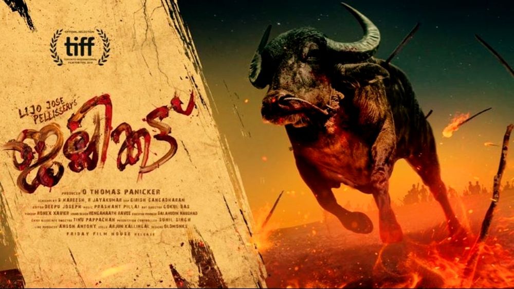
With its jaunty swoosh and water buffalo rampaging through flames, this poster teases at the unique experience that is Jallikatu. Sadly, the lead designer for this poster and this clay design, which is is rather magnificent in its own right, R. Mahesh, passed on this year at 37 years old. You can read about that here .
Designer Akiko Stehrenberger is currently the best in the business. Her work consists of some of the finests poster of the 21st century, including for Michael Haneke's remake of Funny Games, and the very lauded one-sheet for The Last Black Man In San Francisco.
This poster she designed for Neon's release of Portrait Of A Lady On Fire she goes for the look of not-quiet mixed oil paint in the shape of a bonfire - one that also vaguely evokes the image of a woman's long hair with just a hint of curl at the end.
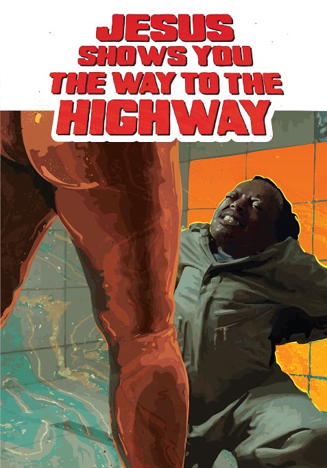
Featuring zero credit block, taglines, or the typical clutter of a movie poster. There is the chunky, cult 1970s typesetting, and only a curiously minimal image. There is a wonderful use of colour contrasting the left and right sides of the poster, and then inverted between Tadasse's jumpsuit and his wife's posterior and legs. If you are going to go with orange and teal - this teaser poster for the culty weirdness of this Estonian/Spanish/Ethiopian/Lithuanian co-production, Jesus Shows You The Way To The Highway is the best use I have seen in a dogs age.
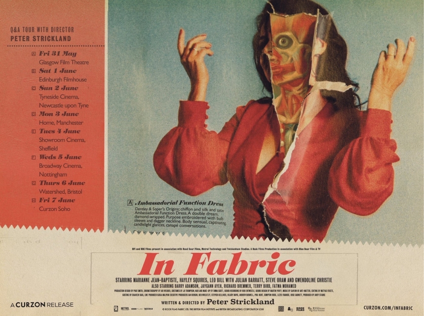
The second Quad design on the list, its faded early 1970s colours, and torn pages, the Quad-Style poster for Peter Strickland's In Fabric is on brand. The film itself has vast, deep elements of catalogue page fetishization, layout, and advertisement of a bygone era of British retail.
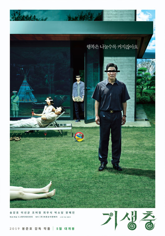
Like everything with Bong Joon Ho's Parasite, it exudes class (OK, pun intended). One thing I love about good South Korean movie posters in general, and Kim Sang-man's design here is a superb example, is that they straddle the line between glossy photographic marketing and uncluttered family portrait.
Icing on the cake is the whole 'crime scene photo', vibe going on in this one, so many askew details are enticing to anyone who wishes to lean in. Are the characters looking at the boy with the prosthetic arm, remembering the past, or looking at the moviegoer in the lobby of the theatre where this poster might conceivably hang?
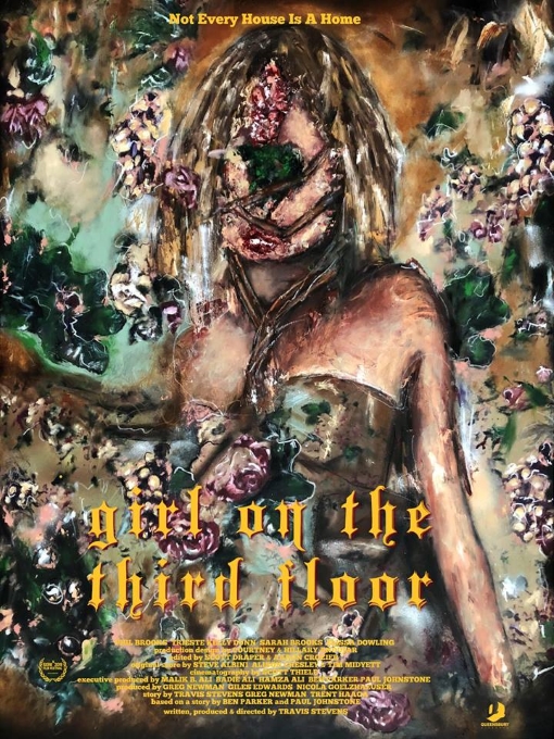
Evoking the middle space between Darren Aronofsky's mother! poster, and the Russell Mills' Downward Spiral art from Nine Inch Nails' iconic 1994 album, the one-sheet for SXSW debuting Girl On The Third Floor is eye catching to say the least.
Flowers, decaying paint, the portrait of a woman in a formal dress cover the gamut of off-pastel colours, with a sharp, gothic stencil of yellow typesetting. The hand painted art is the hallmark of artist Serge Serum who favours portraits in a kind of 'evil ebb' state: Deterioration as both a compromise of beauty and revealer of truth.
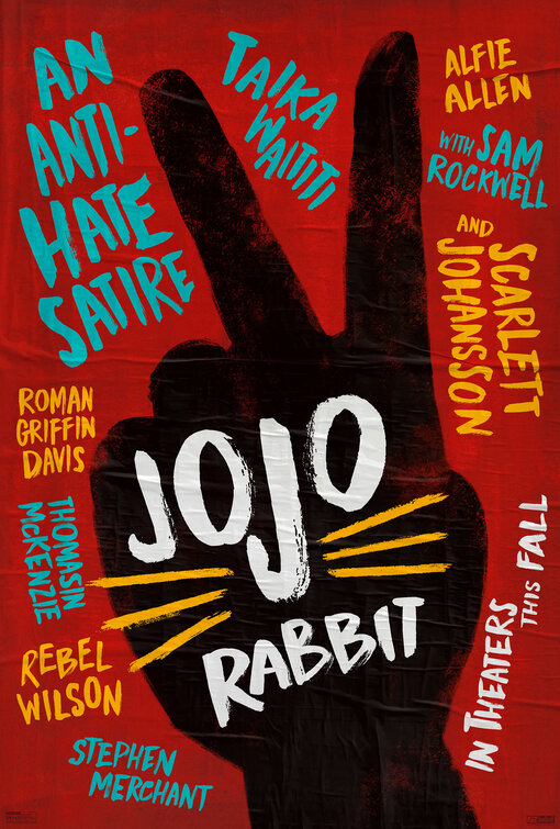
This is one of the freshest designs of the year, the playful play-bill aesthetic (complete with applied airbubbles). The peace sign which also doubles as rabbit ears looks to be a kind of sponge applied and handcrafted. Splashing the actors (and the tagline) all over the plays also appears child like, which again, is on point with the film.
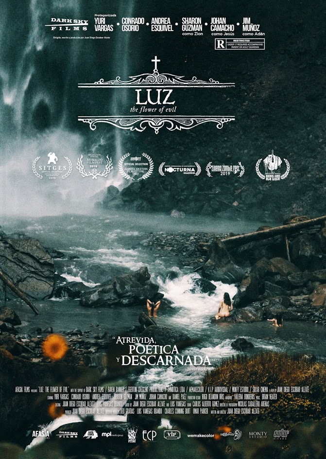
Nicolás Caballero, designs from screen grabs of the gorgeous Luz: Flower of Evil layer distressed old letterpress style text on top of the films principle ladies bathing at the base of a spectacularly large, and ominously cold looking, waterfall. Is that blood on the 'lens' or light leak out of the gate? It is also a catchy splotch of orange which pops off the cold grey.
I never got to write a column on this minimalist A Hidden Life design, with its faded red halo, and brushes of landscape at the feet of its protagonists and lack of credit block.
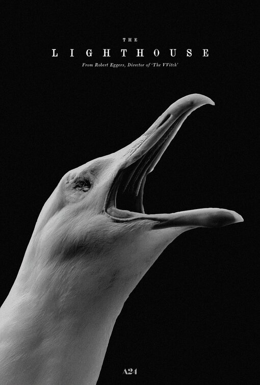
The Lighthouse is a loopy, horrific, sad, entertaining, difficult, oddly-aspect ratio'd, actors workshop of a period horror. The poster is a direct nod to Robert Eggers' previous period horror picture, The VVitch, which favoured a cursed sheep, and a cursed raven.
It is a striking, minimal, image, of a seagull with its eyes gouged out, is evocative of a novel cover as much as it is a movie poster. The multiplex could use more of these kinds of images hanging up in their lobbies.


