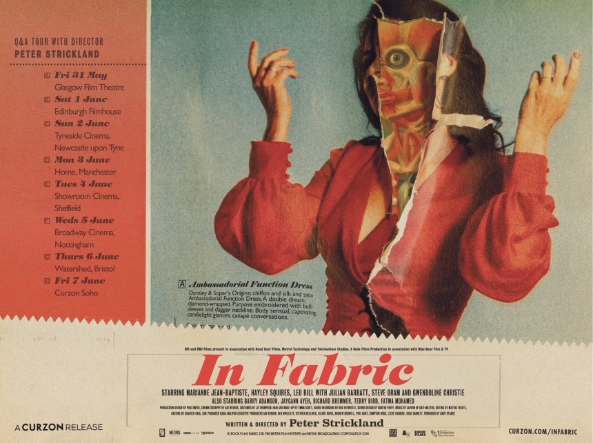
Friday One Sheet: IN FABRIC Catalogue Quad

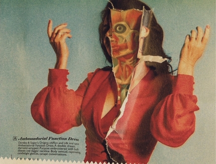
With its faded early 1970s colours, and torn pages, the Quad-Style poster for Peter Strickland's In Fabric is on brand. The film itself has vast, deep elements of catalogue page fetishization, layout, and advertisement of a bygone era of British retail.
A nice touch is the jagged shear cut between the image, the Q&A tour, and the credit block below. Speaking of which, it is rare these days to have this much small text on a movie poster, and rarer still to have a speaking tour with a release of the film.
But all of these elements fit together nicely in this key art package. There is even an 'entry' on the dress style that mentions Denly & Saper's, the demonic department store at the centre of the film.
Bravo!


Do you feel this content is inappropriate or infringes upon your rights? Click here to report it, or see our DMCA policy.


