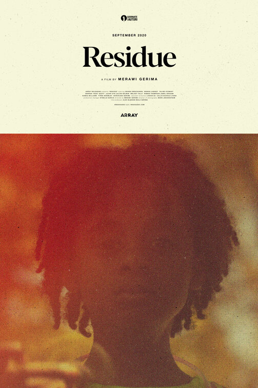
16mm hazy memories. Clear-Eyed confrontation. A reckoning. Tone is important when trying to boil a film down to a single image. UK Designer Matt Needle's key art for Residue is provocative and classy without ever being pretentious or pushy. There is power in simplicity too.
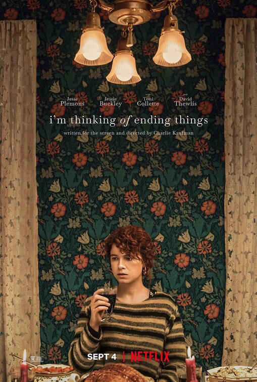
With its emphatic vertical design, imposing use of wall paper, and alienating sight-lines, the Key art for Charlie Kaufman's challenging Straight-To-Netflix film, I'm Thinking Of Ending Things reminded me of last years The Killing of A Sacred Deer.
Design firm Midnight Marauder is no stranger to these pages, with his work making it to the best of column last year on Terrence Malick's A Hidden Life.
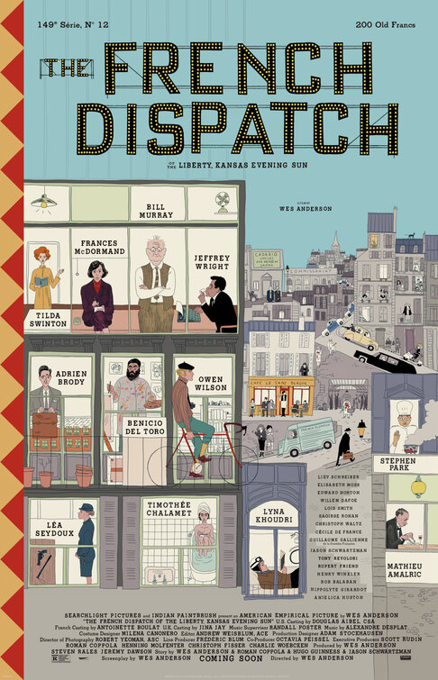
Outside of an almost-debut at Cannes, the New Wes Anderson film, The French Dispatch never did see the light of day in 2020. Maybe next year. However this wonderful 'Little Golden Book' cover collage of a poster did appear in advance of the films festival circuit debut, and it is lovely.
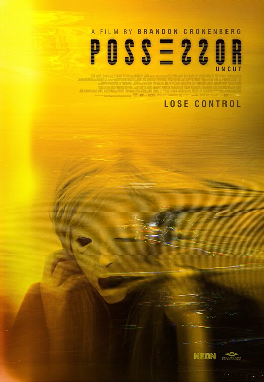
Thoroughly disturbing, this poster for Brandon Cronenberg's spy-horror hybrid, Possessor goes all in on yellow, thoroughly divorcing the colour from its more cliche 'indie dramedy' use. Bravo to that. You simply cannot look away.
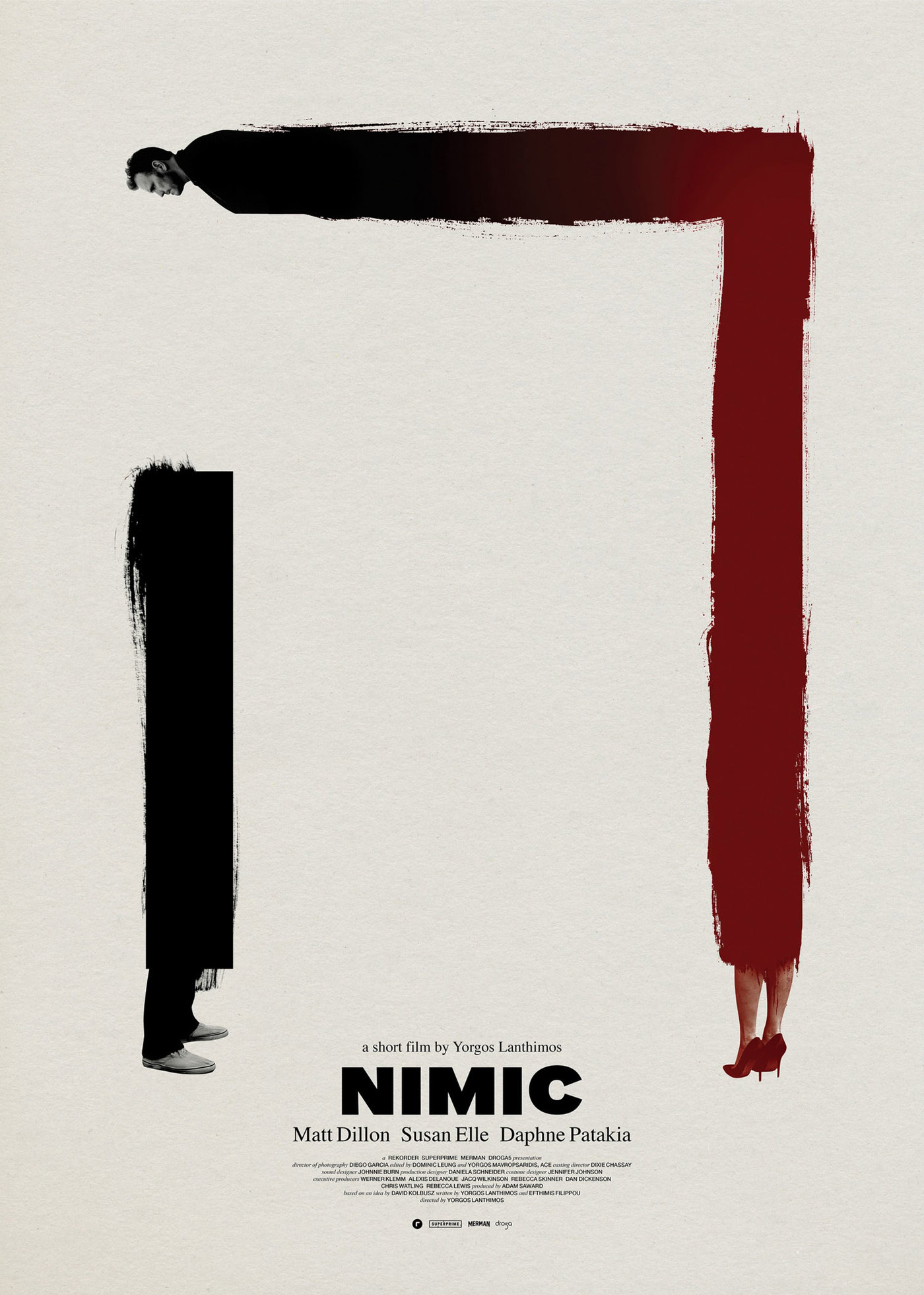
As mentioned earlier, Yorgos Lanthimos' films always get posters from designer Vasilis Marmatakis. While Nimic was only a short, the poster is, like much of Marmatakis' work, rather tall. Here, the form of Matt Dillon is stretched, bent, and seems fluid in gender to boot. It is weird and unforgettable.
It is hard to squeeze anything new out of the 'roots under the house' cliche in key art design. But credit where credit is due with the Mondo Team, and specifically designer Gary Pullin.
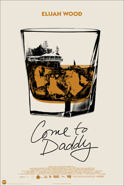
The secret may be in the bourbon, but also, it helps that the narrative of whiplash horror-comedy Come To Daddy has some, quite literal, secrets in the basement.
Sister Hyde Design's blatant homage to the iconic poster for Downhill Racer, for indie period picture, Moving in 2008, managed to stick with me all year, so I am including it here.
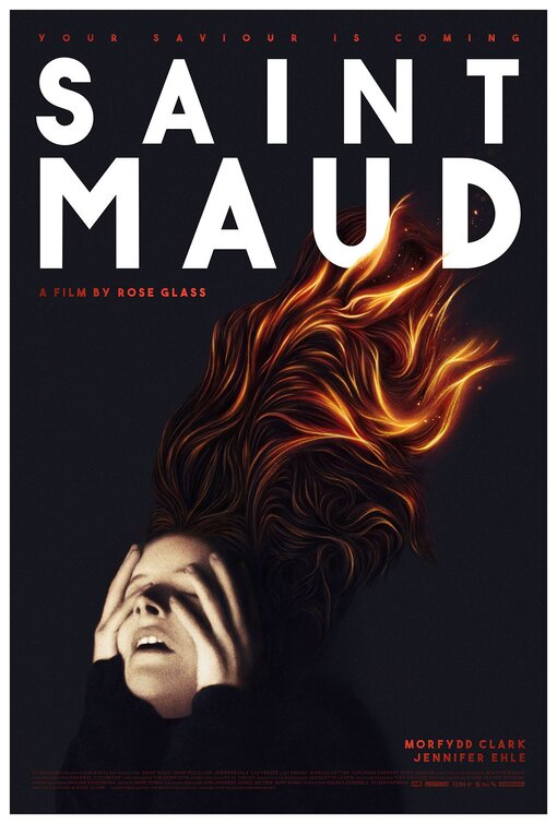
There were several excellent key art designs for British indie horror picture, Saint Maud. But this one, with its negative space, ultra high-grain photography aesthetic, and resemblance to pulp-covers from the paperback boom of the 1960s and 1970s, hits the spot in all the right ways. This poster, with its tiny face and fiery hair, brings to mind the cut-and-die invitations of V.C. Andrews book-covers. You want to turn the page to the elaborate diorama inside.
Black and orange storm clouds, and children jumping the gap on a moving train, the glory of youth in motion. This Eclipse design for Wendy, a riff on Peter Pan from the director of Beasts of The Southern Wild just seemed so perfect and graceful an image.
Kudos to including, but cleverly hiding, the typical credit block in there, too.
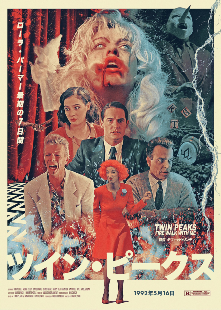
I do indulge myself with some fan-art unofficial designs for classic movies in the column from time to time. This year featured a diverse collection of 'not too old' movies from The Life Aquatic With Steve Zissou to Tremors, but my favourite was this collage style poster which hybridized Hammer Horror stylings with Japanese poster tropes. It's an unholy mess, in the best possible way, that is perfectly in line with the film itself, David Lynch's baffling, cannot-look-away Twin Peaks prequel, Fire Walk With Me.
I liked this so much, I bought a print from designer Sean Longmore, and hung it on my wall.


