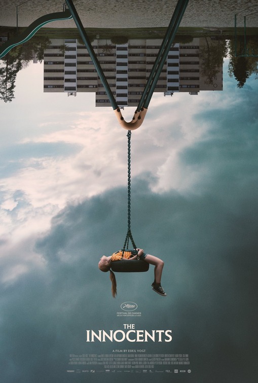
The text placement is superbly uncluttered with classic 'art-horror film' typesetting, the 1970s apartment buildings with brutal concrete architecture. The Innocents suggests the horror of a childhood in this environment. There is something deeply disturbing about the chain of the swing standing perfectly straight up. Is it that sublime moment that kids aim for, a kind of ecstasy that is deeply disturbing when framed upside down.
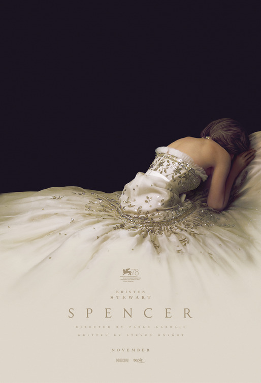
Exquisite fabric meets existential void in this wonderfully tactile piece of key art for Pablo Larraín's Lady Diana biopic, Spencer. I could stare at this infinitely melancholy poster for hours; where expensive cream textiles and perfect white skin meets utter blackness of despair.
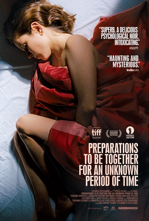
The ungainly title, Preparations To Be Together For An Unknown Period Of Time presents some graphic design challenges due to its unusual length. These challenges were easily met.
The bold lighting of here, the contrast in the white and red sheets, the curves and folds in both, and the dark shadow in the top corner all signal mystery, sex, privacy and vulnerability. Texture and tactility is on point.
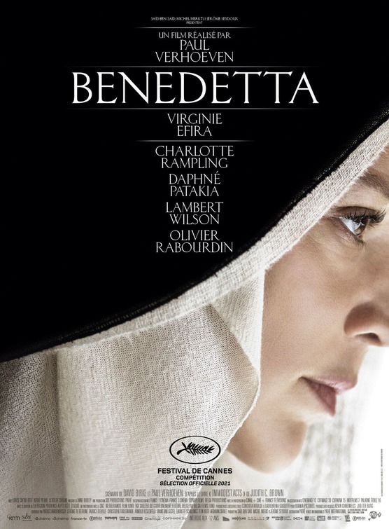
The Cannes teaser poster for Paul Verhoeven's Benedetta is all about tactility: The stitching on the hem of the habit, the ivory cloth, the texture of the skin around the eyes and face. Thankfully light on the photoshop/airbrushing, and featuring lots of negative space, and that gentle curve from black to white, this poster makes a beautiful pairing with Spencer
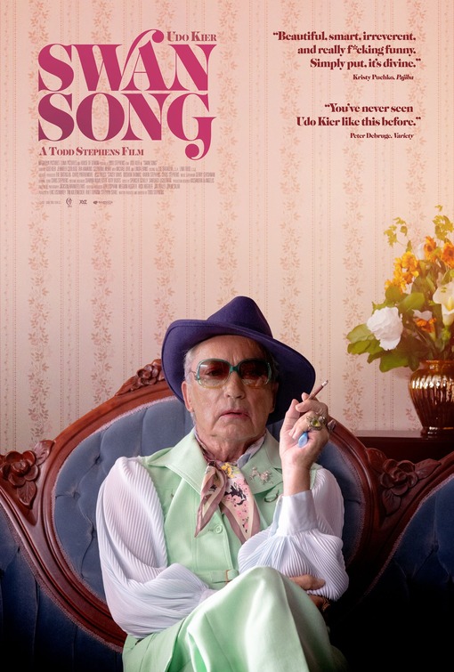
The mint-green vest and pants, the purple fedora, the peach ascot, the perfectly pressed white puffy blouse. Note that the sunglasses match the vest, and the ascot match the wall paper. I also love the detail of the bejewelled poodle broach. This poster, featuring the iconic Udo Kier in marvellous attire, makes you look deeper into its details.
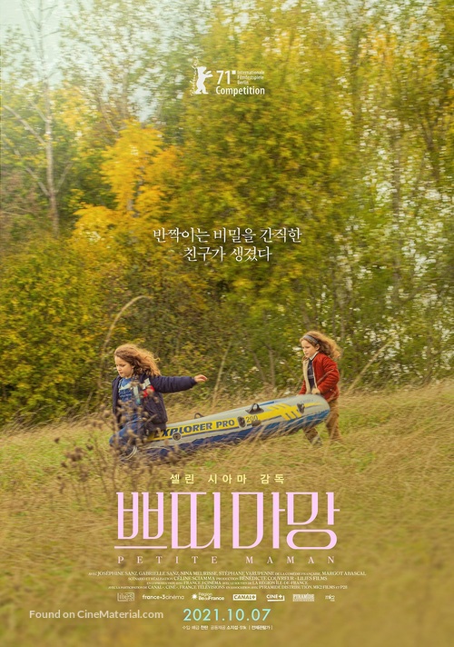
This South Korean poster for Céline Sciamma's Petite Maman, is not as bold as Akiko Stehrenberger's key art for the directors previous film, Portrait of A Lady On Fire. But it echoes the perfectly small mission statement of her intimate new film, and key art, or at least the best of it, should be reflective, and proportionate to the film it is advertising.
It is hard to pick just one poster from Wes Anderson's The French Dispatch, in various key art campaigns that spanned the 1.5 years the film took to get released in cinemas.
Indeed, I was unable to stop myself from featuring three of them here.
This one features Tilda Swinton with an indigenous-art themed gown that matches her hair. Like the actress herself, it is strange and provocative.
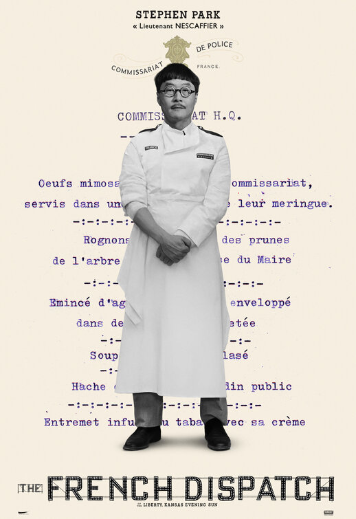
It is hard to pick just one poster from Wes Anderson's The French Dispatch, in various key art campaigns that spanned the 1.5 years the film took to get released in cinemas.
Indeed, I was unable to stop myself from featuring three of them here.
This one features the magnificent American character actor Steven Park in a gloriously ridiculous combination fo hair, glasses, chefs frock, and business casual underneath. The typewritten menu as the backdrop is icing on the proverbial cake.
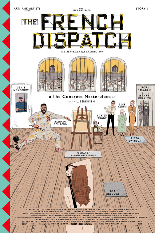
It is hard to pick just one poster from Wes Anderson's The French Dispatch, in various key art campaigns that spanned the 1.5 years the film took to get released in cinemas.
Indeed, I was unable to stop myself from featuring three of them here.
This one was one of the short-story focused, hand drawn pastiche for the best of the segments in the film.
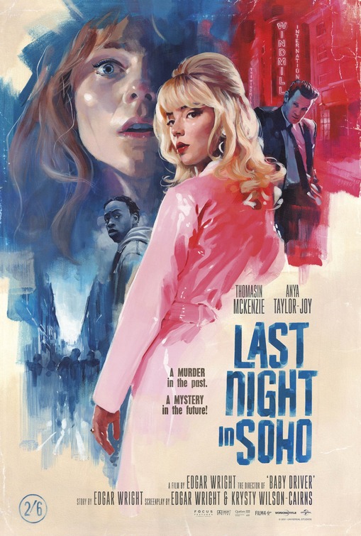
Lots of hand-painted love went into this design for Edgar Wright's 'hysterical female' thriller, Last Night in Soho - where everyone feels like a water-coloured ghost.
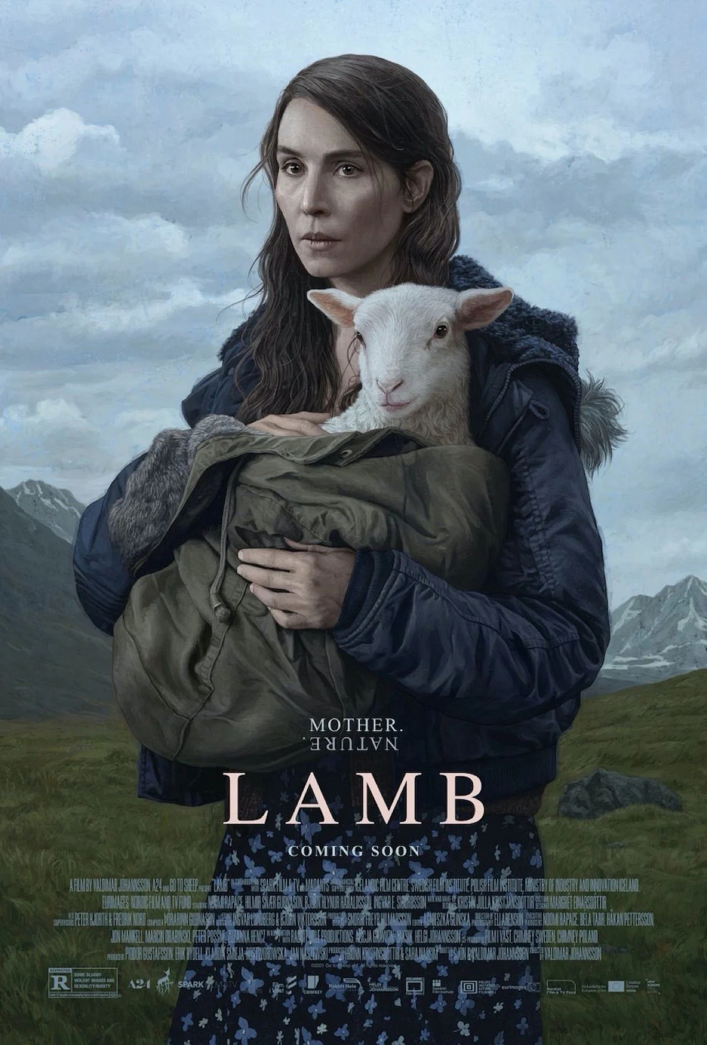
The hand-drawn aspects of this poster for Valdimar Jóhannsson's sublimely weird Lamb are so subtle as to place the whole key art into the uncanny valley space. Oh, so spot on with the film. Enjoy the weirdness here, the film is even stranger.
The most surreal and terrifying poster of the year goes to Yellow Veil Picture's rescue slash re-release of George Romero's 'old age' PSA, Amusement Park which harkens back to strange Polish school of poster design.
The soft blue gradient looks almost hospital institutional, and the highlight of the head-wound (sustained by the character in the film) certainly underscores this. And finally, the tagline, "See You In The Park, Someday." is ominous and inevitable. We are all going to age, and it is going to be horrific.
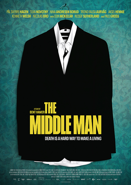
I am committed to showcasing key art that makes good use of textured wallpaper (see also Swan Song. Bent Hamer's delightfully deadpan The Middle Man has a minimal one sheet: An anonymous black suit as the singular image, unfussy block yellow text, and an astute, but corny tagline (in white) to indicate that, yes, this is a comedy.
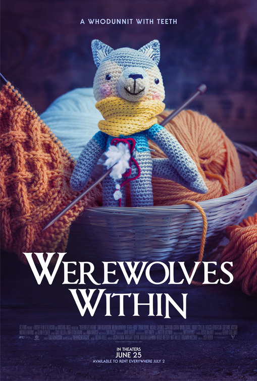
Yarn. It's super cute. And makes me feel all fuzzy. The glorious hygge of the poster for Werewolves Within cannot be understated. Wolf-crafting is a thing here in this cheeky and whip-smart poster.
The neo-psychedelic, pink and blue poster for The Spine of Night hits kind of a Twilight Zone on acid vibe, with a hint of Krull for this rotoscoped ultra-violent fantasy film.
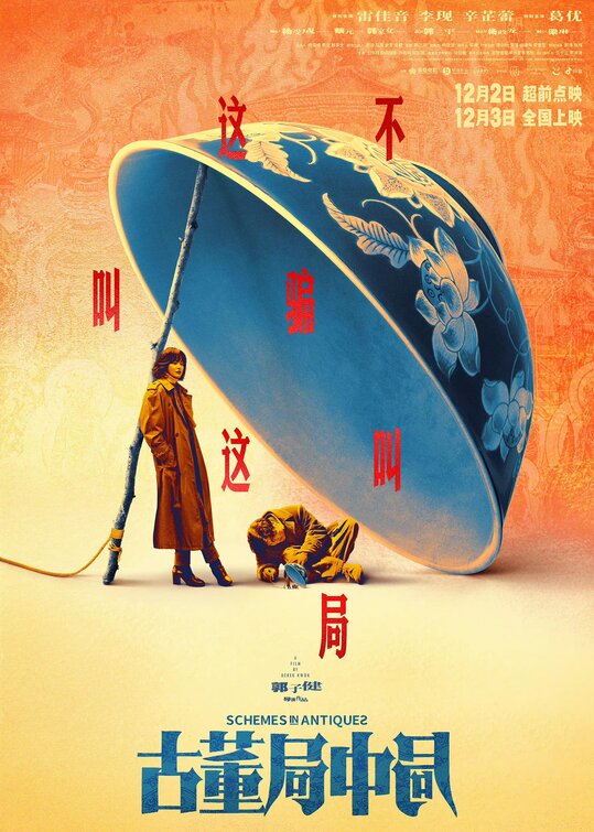
"Orange & Teal" comes to China with this key art for Schemes in Antiques, with its tea-cup trap, and repeating units. It might all be a bit much, but it tickled my fancy. Admittedly, I am a sucker for orange posters.
The casual lean on the 'stick' by the lead actress, Zhilei Xin, seals the deal with this one.


