Friday One Sheet: DROP

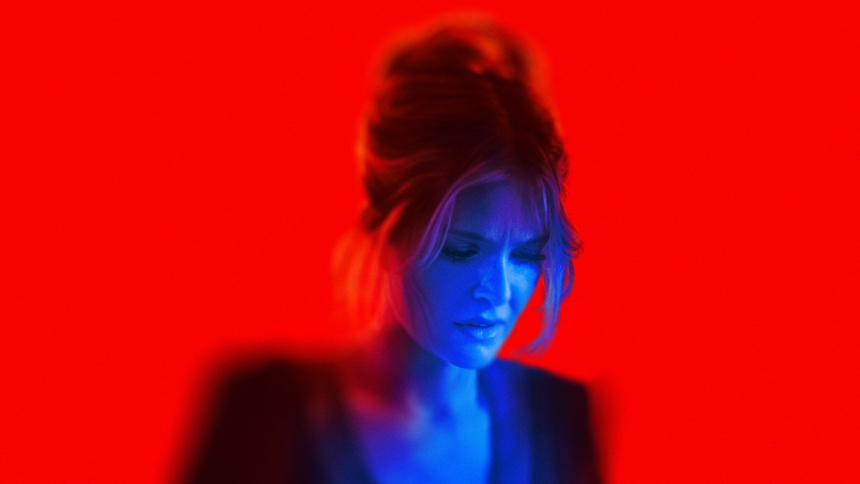
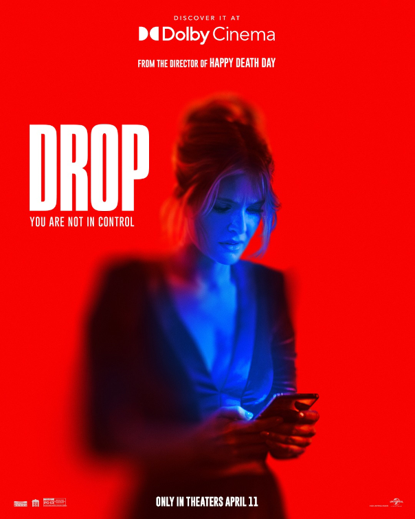
Does a woman glancing at her phone on a blank field constitute a good piece of key art? This is debatable. However, give that blank field the most saturated red (colour coded for horror film) with no gradient, and put a high contrast blue tint on her skin... perhaps design house LA is on to something.
The design has blurred the edges of her figure, and her hair, to preserve the sharpness on her face, and her phone which does somewhat communicate that this film is going to focus on those things.
The logline for Drop: "A widowed mother's first date in years takes a terrifying turn when she's bombarded with anonymous threatening messages on her phone during their upscale dinner, leaving her questioning if her charming date is behind the harassment."
The title card and tag line sit on her shoulder, as if to underscore what she is reading there, "You are not in control." Everything else pretty much gets out of the way (including, you guessed it, no credit block).
In a crowded multiplex, and one increasingly dominated by digital screens instead of printed posters, this hyper-saturated red is going to stand out from the crowd, even if the design might also give the impressions that it was done at the last minute.