Friday One Sheet: The DOWNHILL RACER Homage, MOVING IN 2008

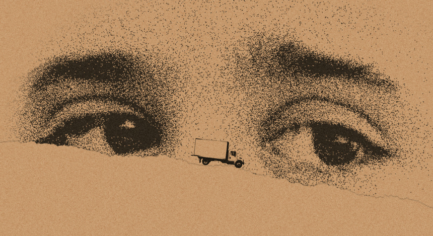
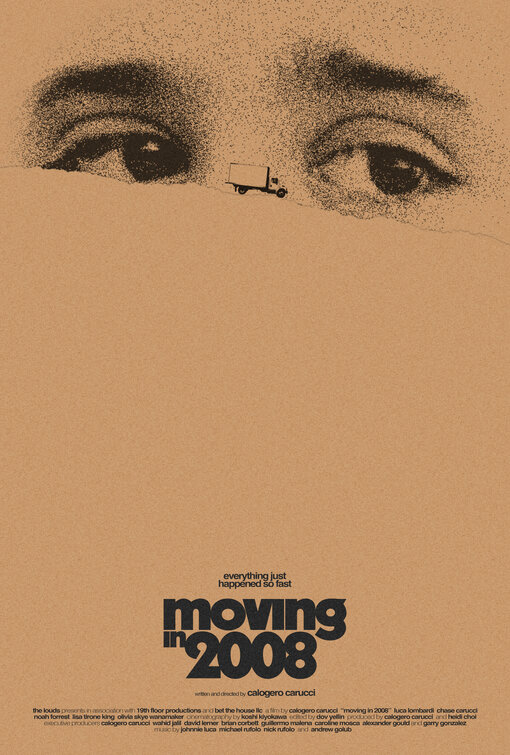
The pleasures of minimalism are on display in Sister Hyde Design's design for the great recession drama, Moving in 2008. Every now and again, I note an homage to one of the more iconic posters of the late 1960s, the Robert Redford sports drama, Downhill Racer. Itself, perhaps, a riff on the memorable key art for Roman Polanski's Rosemary's Baby.
Either way, it is a great way to get both a close up and a 'small figure in the landscape' in the same image, juxtaposed for further effect, on a field of drab beige, the sad colour of home interiors of the early 2000s, or at least the ones real-estate agents stage for a new buyer.
Calogero Carucci's tragic story is set during the recession of 2008, catalyzed by unemployment, personal crisis, and illness, where so many middle class American's lost their homes and their financial futures. You can see much of this in the uncertain, melancholic eyes. It is always a good idea to emphasize the eyes in a poster, as it locks in the casual viewer. Windows to the soul and all that.
The rest of the design is a blank slate, all the way down to the tightly squeezed (kerning, yo!) Title and the tagline, "Everything just happened so fast." Just is an interesting word. I am confident its shortform, for 'justice - what is morally right or fair' is used for bleakly ironic purposes, if that was in any way intentional.


