Friday One Sheet: RESIDUE

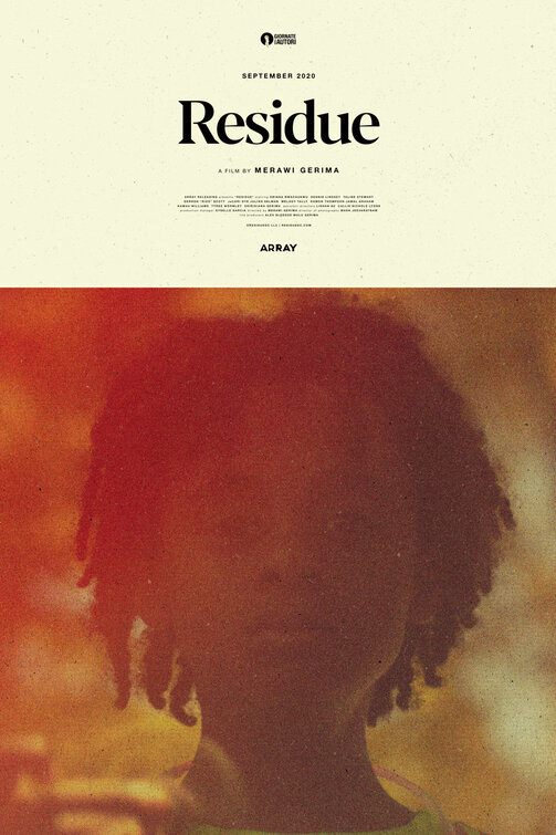
The key art for Merawi Gerima's Residue is capital "S," serious: Classic typesetting, centered title cards and credit block on what appears to be, expensive paper-stock. Looky there: noils! Also, the logo for the hip offshoot of the Venice Film Festival, Giornate Degli Autori, indicates too cool for school credibility.
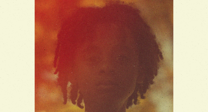
This gives way to the high-grain slightly light-leaked photo of the films' principle staring directly at us. UK Designer Matt Needle's key art for the film is striking, and provocative, and very classy without ever being pretentious or pushy.
It give a tone: 16mm hazy memories. Clear-Eyed confrontation. A reckoning.
I looked up the plot summary to the film, and it is thus: "A young filmmaker returns home after many years away, to write a script about his childhood, only to find his neighborhood unrecognizable and his childhood friends being scattered to the wind."
I get it.
More importantly, I want to see this film based on this design, which is almost universally the goal of a movie poster.


