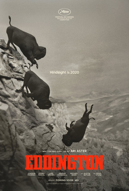
Eddington
If there was even a wisp of a theme to 2025, it was the full collapse of trust and communication in communities into hostile bubbles. Basically the internet bleeding into real life. Leading the charge on that was Ari Aster's Eddington, which teased with this poster of buffalo charging and tumbling off of a cliff.
The powerful central image here is doing the heavy lifting here, but that tagline is perfect.
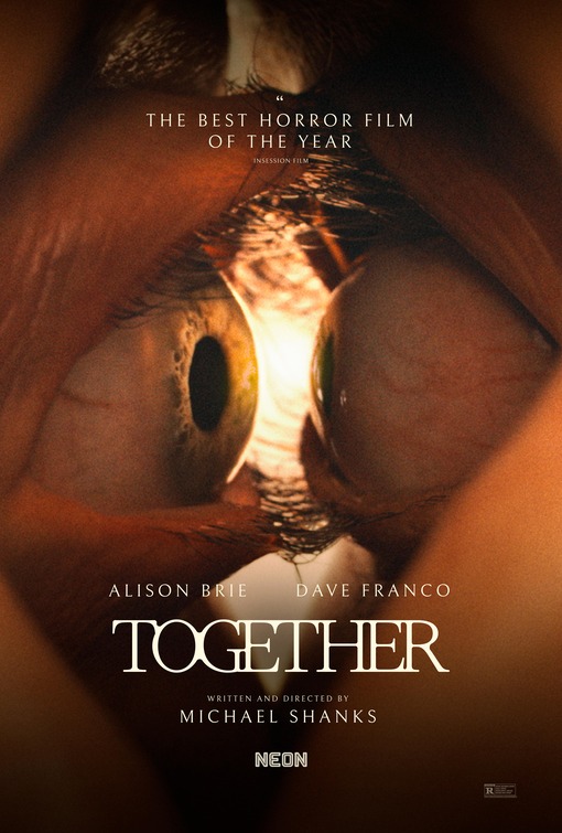
Together
The eyes have it. Another teaser poster, this time for a body horror relationship drama that punched well above its weight. One the most disturbing posters of the year, based entirely on proximity, even the typesetting is too close for comfort on this one.
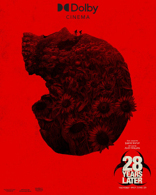
28 Years Later
Our third teaser poster of the bunch here. The long delayed sequel to 2007's 28 Weeks Later... keeps the look of the original two films key art design language: Strong red fields and the biohazard symbol. It introduces the skull as topography. Skulls (great big piles of them) were perhaps the most central image of the film, so the design works even better after you have seen the film.
If you look close enough, there is life blooming on the skull, in the form of sunflowers, as two tiny figures sprint across the valley (of the shadow of death).
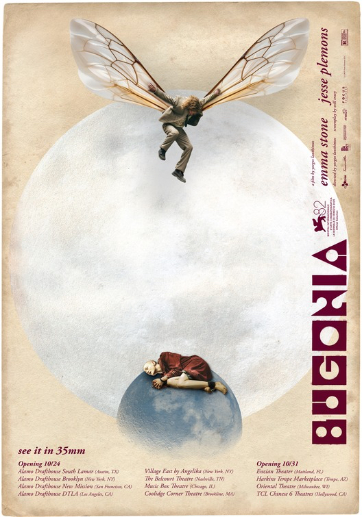
Bugonia
One can always take their pick of several posters by designer Vasilis Marmatakis for any new Yorgos Lanthimos film. Marmatakis consistently makes the annual top list, as Lanthimos prolific run of putting out a movie (or two) every year.
That font though...
Bugonia is a remake of cult Korean film Save The Green Planet, but the key art design here goes its own way leaning heavily into both cosmic and insect imagery. This is something about Jesse Plemons in a ratty suit with bee wings in full Kamikaze pose that makes this one hit the best.
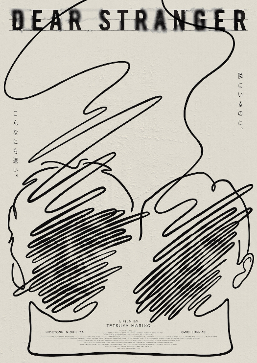
Dear Stranger
Done in the signature style of designer Aicon ("THE HUMAN UNIVERSE IN NEO CLASSIC") where the faces of key characters reveal themselves almost like a 'magic eye' poster, they have brought this design to movie posters before, with the Japanese key art of Joachim Trier's The Worst Person In The World.
In the right context, I hope more of their work finds its way into poster design in 2026 and beyond.
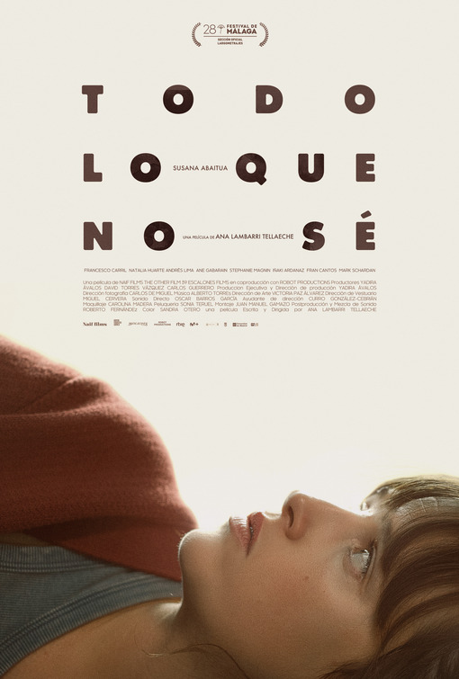
Todo Lo Que Sé
Typography so interesting that the lead character cannot help but stare at it. This warm, creamy, key art design is from Spanish designer Octavio Terol Bernabé.
It checks a lot of interesting design boxes, from its chunky font with wide kerning, to placing above the line credits right in the middle of things, to the credit block in the middle of more than 70% of the posters negative space, and most significantly the eye-line of its actress staring at it all. Even the festival laurel at the top is like a little crown.
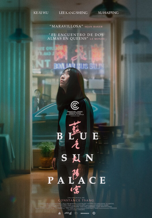
Blue Sun Palace
This Spanish poster variant has a beautiful verticality to it. The lead character is framed by a long window, with lines of hazy light coming through the vertical blinds. Hanging pendant lights drop down from the top of the design. She is looking up, her face illuminated from overhead, a skylight perhaps? The arm of her clothing is visible -- a tracksuit with vertical lines.
The vertical theme continues with the text elements. The pull quotes are stacked above the neon lights (outside the window), but the title, in both English and Mandarin is displayed vertically as well.
This is second poster from designer Octavio Terol Bernabé, whose typography heavy design for Todo Lo Que No Sé also made it to this 'best of' list.
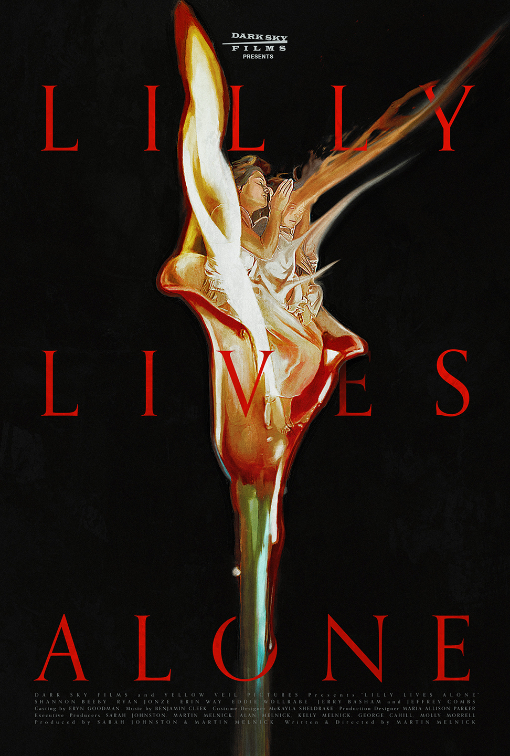
Lilly Lives Alone
The hand drawn poster is coded with a black background and red text, where the Gothic Romance and horror vibes are strong with this design, which echos the look of ubiquitous V.C. Andrews novels from the 1980s.
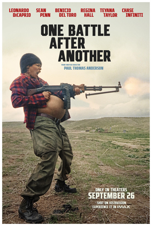
One Battle After Another
This poster, one of many official and variant posters for P.T. Anderson's instant large-format cult-hit, makes the list simply for the provocation of its central image. An image which dominates everything.
A very pregnant far left radical Perfidia Beverly Hills in flannel and khaki, firing a heavy calibre rifle, with the belt of shells resting on her swollen belly. The film is brimming with artful and memorable images, but this one works best on a poster.
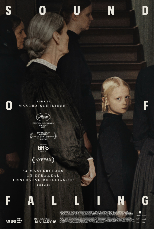
Sound of Falling
The final 2025 poster in the column this year was strong enough to also make the 'best of' list.
The gaze of the young girl. The contrast of black fabric and pale German skin tones with hints of white lace. The committed level kerning on the word "of," where the two letters bracket the little girl staring at the camera, and the director's credit.
Like the film itself, this poster is both visual and tactile.