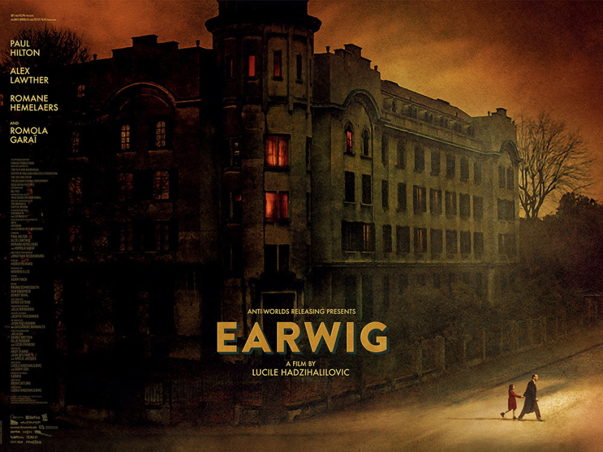
This Quad style poster for Lucile Hadžihalilović's Earwig was designed by the iconic Laurent Lufroy. It echoes a piece of art used in the film, but here, it features the two principal characters, a young girl and her mysterious caretaker as they leave the insular world of their large postwar apartment, and navigate a strange, fecund world outside.
The film is a dark parenting faerie tale, and this key art certainly evokes a house on fire.
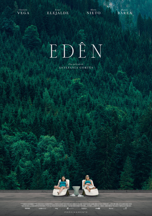
I never got a chance to catch Estefanía Cortes's spa-trauma Edén on the festival circuit or in the cinema, but the poster stuck with me until the end of the year.
The stark white loungers and cut stone is at brilliant odds with the dark greens of the rest of the poster. The overall effect is both ominous and indifferent. Kind of like nature.
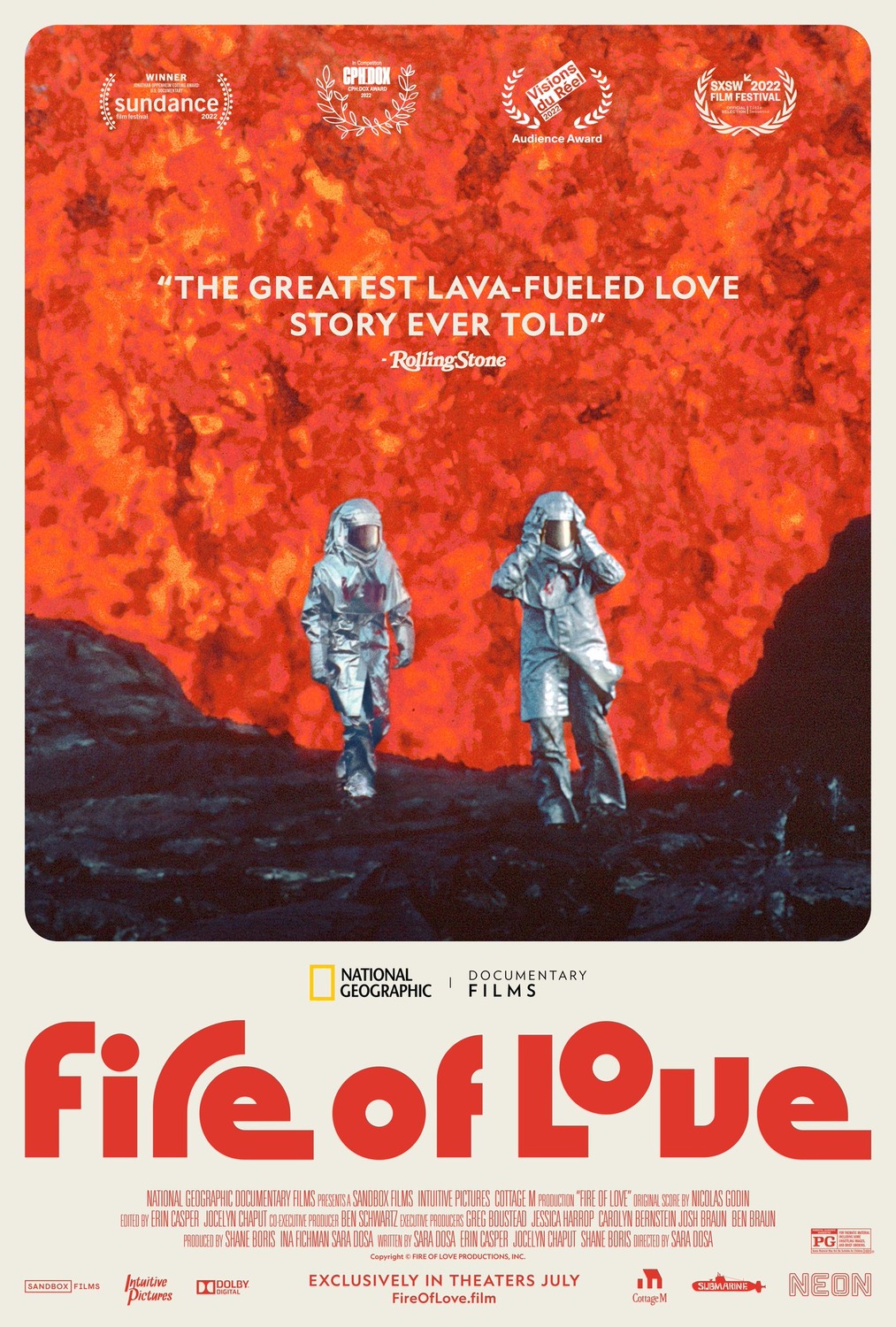
Somehow I never managed to post a column on the remarkably eye-catching design for National Geographic's break documentary cum tragic love story Fire of Love.
The wall of lava and the silver space suits, framed in a polaroid style design with that 70s era typesetting on the title, it stands out from the crowd.
While the film itself did not live up to expectations I had for it, the marketing for Alex Garland's Men, including this verdant, symmetrical piece of key art, were engaging.
Jessie Buckley in shadow, framed by a tunnel and its watery reflection, with the tagline "What haunts you will find you." The poster gave off huge ominous vibes.
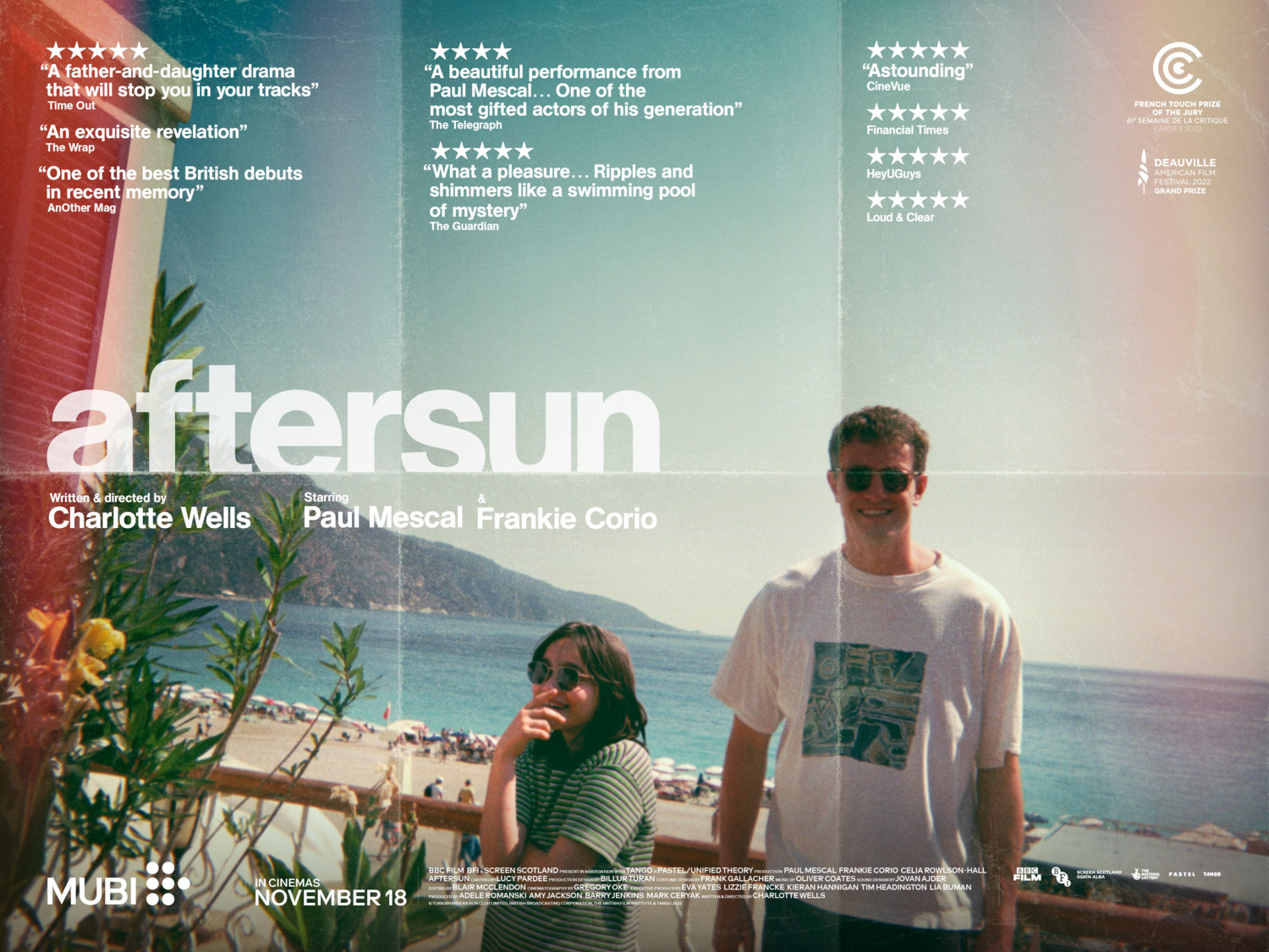
Like a beaten, folded photograph, this Quad design for Aftersun offers a vibe. While the trend of fold-lines and faux-distress in movie posters is well behind us at this point, design house Intermission Film uses the aesthetic in a way that is true to the form of the film itself.
I also really like how all the text elements, including the title, the critic pull quotes, and even the credit block, are neatly sorted and laid out in the folds.
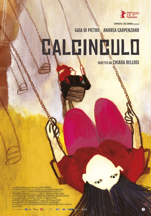
The one sheet for Calcinculo nails space and geometry. Leaning into the diagonals, with its title card and key credits in the upper right corner.
The hand-drawn festival poster that captures that exact moment on a swing where you simply let go and enjoy the gravity of the situation. The main figure's hair is splayed out in all directions which tells one all they need to know about 'letting go.'
The festival poster for Jerzy Skolimowski's Eo, it is all focused on the 'melancholy eyes.' Inspired by Robert Bresson's classic Au Hazard Balthazar, one of cinema's finest acts of pure empathy.
The pure red field, and tiny typesetting and low-centre credit block, leave all the work to the donkey's face. And what a magnificently sad face it is.
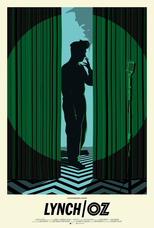
The key art for Alexandre O. Phillipe's film theory documentary Lynch/Oz was designed by prolific illustrator and art director Andrew Bannister. A creamy Polaroid style photo-matte number that focused on a few key images: The Spotlight, the Microphone, the Curtains, The Auteur Director, and the Witch.
The curtains and tint lighting are, of course, in green to further evoke the iconic make-up design on Margaret Hamilton's Wicked Witch of The West, and the floor design and the cigarette smoking are signature Lynch. The only thing missing her is a cup of coffee.
This was the first One Sheet column I wrote in 2022, and the poster image, even if on the nose of a film titled Sundown has stayed with me until now.
Tim Roth, slumped and dwarfed by the sea, with a digital and grainy gradient, is not as warm as the colour tones suggest. The pull quotes contradict offering 'burns' and 'chilly,' as well as, 'pitch-perfect' and 'dangerous'. The film is all of these things, and that is its magic. It reflects perfectly the tone and nature of the film: tranquility, physical exhaustion and emotional lethargy.
This is the end.


