Friday One Sheet: EARWIG

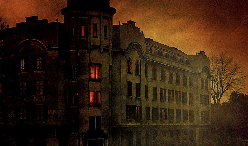
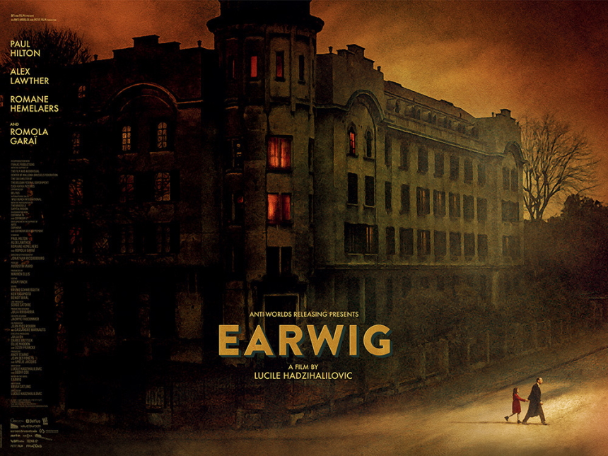
The British Quad-style poster feels like a rare bird these days, so it is a joy to behold this fiery key art for Lucile Hadžihalilović's peculiar, moody, mysterious film Earwig. The poster, designed by the iconic Laurent Lufroy, echoes a piece of art used in the film, but here, it features the two principal characters, a young girl and her mysterious caretaker (and dentist) as they leave the insular world of their large postwar apartment, and navigate a strange, fecund world outside their spartan walls. The film is a dark parenting faerie tale, and this key art certainly evokes a house on fire.
(Note: I am a wee bit late to the release of this poster back in May, as I was on holiday at the time. However, I would be criminally remiss not to circle back around to such a gorgeous example of movie advertisement; so here we are.)
I like the design choice of pushing the entire credit block to the left hand side, like a newspaper column. The emphasis then can stay on the bolded mid-century type-setting of the films title card, while the eye can wander, at its own pace, over to the slowly exiting pair in the bottom corner. The warmth, and the gloam, and overall imposition of the architecture dominate the whole design, giving you a feeling, and impression, even if you do not know exactly what is happening. This is very much the experience of the watching this marvelously strange movie.


