Long Legs
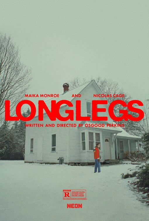
Perhaps the most extensive, and arguably the best, marketing blitz of a movie in 2024 (outside of the unavoidable Deadpool & Wolverine, I suppose), this was may favourite image from perhaps 100 different poster designs that seemed to endlessly flow out of NEON's instagram feed.
The red accents on the title, rating, and of course the lead character's winter coat, all pop out from a snowy, murky design that favours negative space. Instant dread achieved. Exactly the key strength of the film.
Any Where Any Time
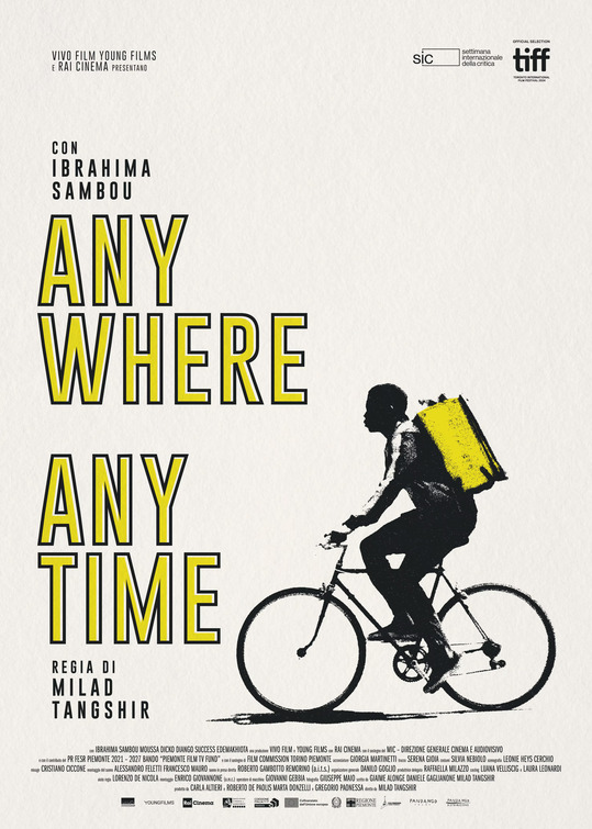
A homage to Vittorio De Sica’s post-war poverty classic, The Bicycle Thief, updated to the gig economy. Like the stripped down cinéma vérité of that film, the key art for Milad Tangshir’s film has a spare, almost Banksy street art feel.
On a creamy textured background, there are only two tones at play here: black and yellow. The colours of transportation (think taxis and road lines). The lemony outlined text rhymes with the lead character's branded gig economy' backpack, while the lead character himself is a fuzzy, hazy, charcoal drawn profile, with the credit block providing a visual foundation for the bicycle element.
Do Not Expect Too Much From The End Of The World
One of the single sneakiest best films of this year (or last year on the festival circuit), Radu Jude's film is simply punishing until it wins you over in the end. Its marvel of a lead character is a kind of echo to Anora, where the latter has stars in her eyes, here the over-worked lead character here exudes end-of-her-rope exhausted energy.
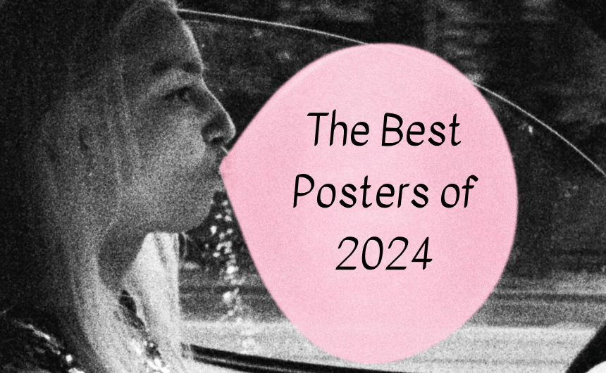
Working the mouthful of a title into a huge pink bubble-gum bubble (while driving through a black and grey world) feels exactly the right way to boil down this maximal film -- not just the title, but also the run-time -- into a single image.
A Traveler's Needs
Brian Hung’s design for one of two Hong Sang-Soo films this year, which is also the director's second collaboration with Isabelle Huppert.
While the poster does not entirely eschew a credit block, it is oh so subtly snuck in, as the lights on the buildings far away from the verdant greenery that dominates the image. This has to bee the greenest poster of the year by far.
For Hong aficionados that know his films always involve a lot of drinking there is a small bottle or rice wine in the corner, and the Korean text on the stone is apparently a synopsis of the film. Unusual. The dark difference between the grey and the green makes the films star, despite being so tiny, pop right out of the design. Gorgeous.
Anora
Stars in her eyes and painted lips. This key art for Anora does just a slightly better job of capturing its lead character compared to a similar one for Ti West's Maxxxine. Sorry Mia, you were a great shining star last year.
I Saw The TV Glow
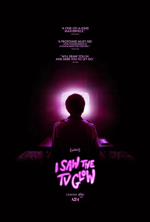
The sweet purple nostalgia-nightmare of Jane Schoenbrun's ode to young adult television of the 1990s gets an echo to iconic design for Tobe Hooper's Amblin' horror classic Poltergeist. Is there a credit block for this poster? Of course not.
The Bike Riders
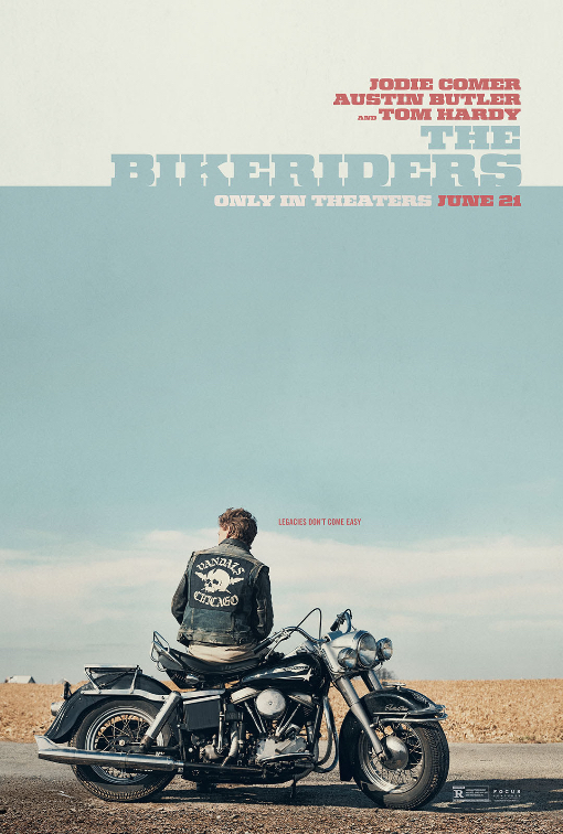
Exuding casual mid-century mid-western cool, freedom and wide open space, the key art for Jeff Nichols' biker saga, spanning the 1950s and 1960s rise of The Vandals, wears its iconography with ease.
No credit block for this bad boy, just the above the line stars in block-font, off-white and off-teal. The design exudes and undiluted confidence, the same as the independent, rebellious characters within. The rest is glorious negative space, like the good lord intended.
Faye
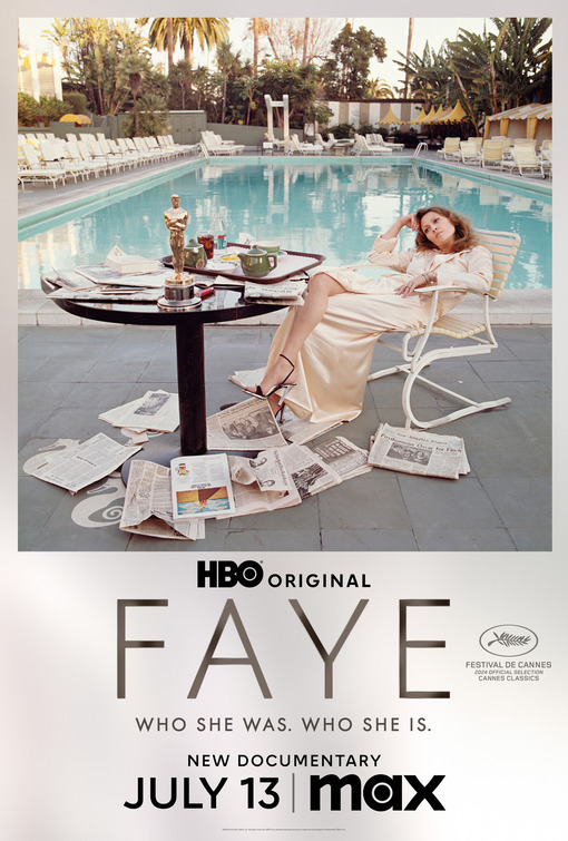
A photo taken by her beau at the time, photographer Terry O'Neill makes for a great poster for HBO's documentary on New Hollywood fashion icon and movie star. Her Oscar on the table, and a veritable treasure trove of easter eggs in the form of half-glimpsed headlines on the scattered newspapers at her feet.
Of course there is no credit bock here, even as the 'Polaroid' design offers an obvious place for it.
The Second
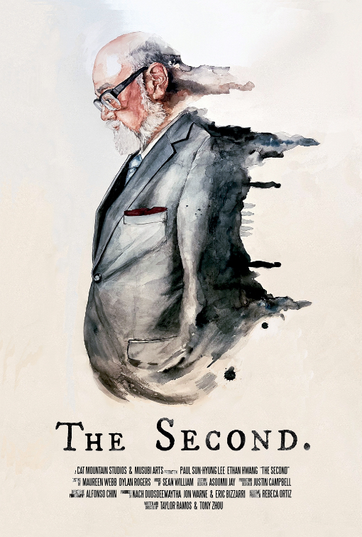
The only short film poster on this list, it is memorable for it's clean image, hiding the central sequence of the film in the running water-colours of the main character's back. Turn the poster sideways, and you see the gun dual at the heart of the story.
Godzilla Minus One Minus Color
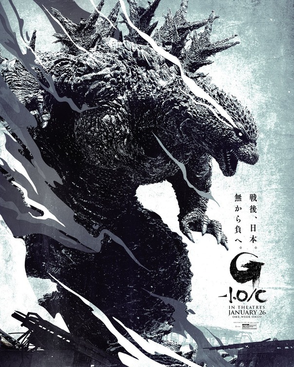
Released in the early days of January, this rendering of Japan's un-killable beastie is both iconic and terrifying. One of the best posters for the dozens of films made with everyone's favourite Kaiju.
The Brutalist
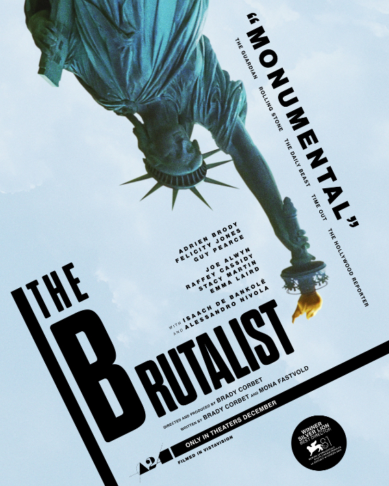
One of the best films of the year had very careful attention paid to its festival launch, its initial trailer, and its key art. The image of the upside down Statue of Liberty may make a bigger impact in the film itself, even if it sums up perfectly, one of the key themes. I would argue that the typesetting here is the star of the design.
Civil War
The second film to feature the Statue of Liberty, this image is not from the film itself, but it made for a superbly teasing short-hand image for Alex Garland's take on an alternate future-America.
 If there was one trend I saw when selecting Key Art for this column in all of 2024, it was nearly every designer doing their utmost to not include the credit block. Either there was an unusual number of teaser posters released this year (entirely possible) or the notion that the credit block, no matter how tiny the print, is no longer wanted or needed. This is akin to most studio blockbusters moving their opening credit sequences to the end of the film starting about 15-20 years ago.


