Friday One Sheet: SUNDOWN

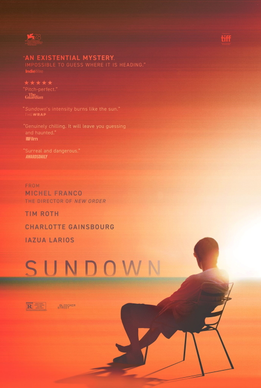
We posted the superb trailer earlier this week, and now this excellent poster for Michel Franco's Sundown. I have said, time and time again, that I am a sucker for orange and pink posters, and this is no exception. I can more than forgive the literal design choice of making the principal element of the key art for a film called Sundown, an actual sunset. It makes perfect sense though.
Nevertheless, the curiously digital and grainy gradient, along with the body language of the figure (Tim Roth) in the one-sheet, is not as warm as the colour tones suggest. The figure is isolated and slouching. The pull quotes contradict offering 'burns' and 'chilly,' as well as, 'pitch-perfect' and 'dangerous'. The film is all of these things, and that is its magic.
Eschewing a traditional credit block (unusual for an arthouse film which has already played the festival circuit, from Venice to TIFF) and foregrounding the R rating, the Boland Design Company, the firm behind the poster, was wise to keep to this kind of minimalism. It reflects perfectly the tone and nature of the film: Tranquility and emotional lethargy.