Friday One Sheet: DALVA

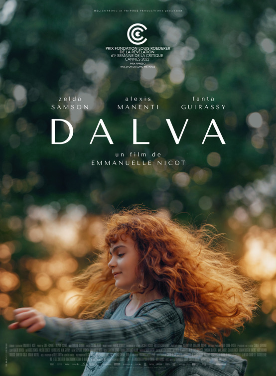
This balanced piece of key art from design house Silenzio taps all the photography basics. Rule of thirds? Check. Bokeh? Check. Implied motion with low shutter speed? Check.
In the digital-layer decades of over-processed, and cluttered, movie posters, the French, like the South Koreans, have taken a step back and focused on solid photography principles to deliver compelling key art. (For a nice fusion of the two markets, see the Korean key art for French magical-realism drama Petit Maman.)
Even the typography elements of this poster have a pyramid-like flow that does not interrupt or over-shadow the rule of thirds here; the credit block is present, but tiny, and parallels with the wave of Zelda Samson's swinging arm. The warm glow of the middle section has the sunlight rhyme with Samson's hair, which on one side is tack-sharp in focus, and the other is moving. It evokes the 'limitlessness' of childhood, and a connection to the outdoors and nature is the most subtle of ways.


