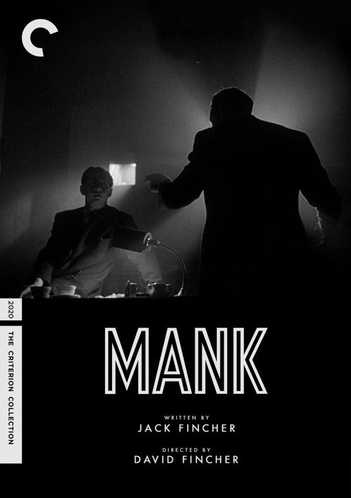
Friday One Sheet: MANK and the Fake Criterion

The films of David Fincher never let a typeface or design opportunity go to waste. Considering he is recreating a specific Hollywood era - the production of Orson Welles cinematic milestone and political bombshell, Citizen Kane - with his latest film Mank, the opportunity for retro, nostalgic designs of for key art (and of course, an opening credit sequence) is huge.
This is probably not an official poster in any way for Netflix, who is producing Mank, as it is 'quoting' the design aesthetic of key competitor, one with an 180 degree philosophy, a boutique physical media curators, of fine cinema, instead of the fire-hose of content that is the streaming giant. It even uses the "C" logo and a spine number, albeit in a different sort of prophetic fashion, the release year of 2020.
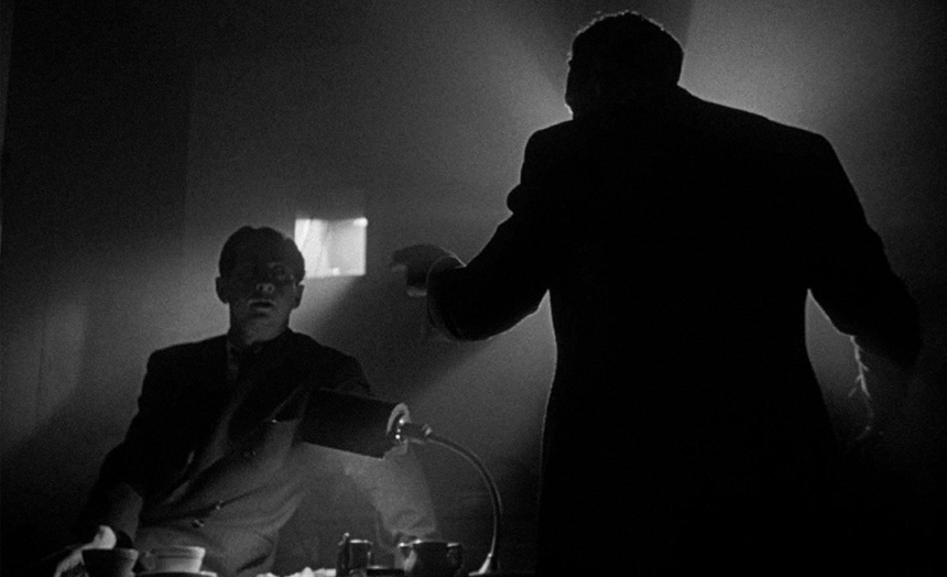
Nevertheless, Alfonso Cuarón's Roma was indeed added to the Criterion Collection in 2019, so the presumption here, as a marketing tool, is not entirely out of the realm of possibility. I have been unable to locate origin of this Fake Criterion Cover (a design micro-genre I dearly love) beyond a Fincher Analyst twitter feed, but I thought I would share it here, in its high contrast black & white glory. Even though the core image may lack the deep focus pioneered by Citizen Kane cinematographer Gregg Toland, it more than makes up for it with expressionist backlit chiaroscuro.
I realize that there are vast differences between designing a bus-shelter sized broad-sheet and the packaging of a Blu Ray, but considering how much of all of this stuff we first see it in digital form, on screens of varying sizes, I am happy to shoe horn something I love into this space.


