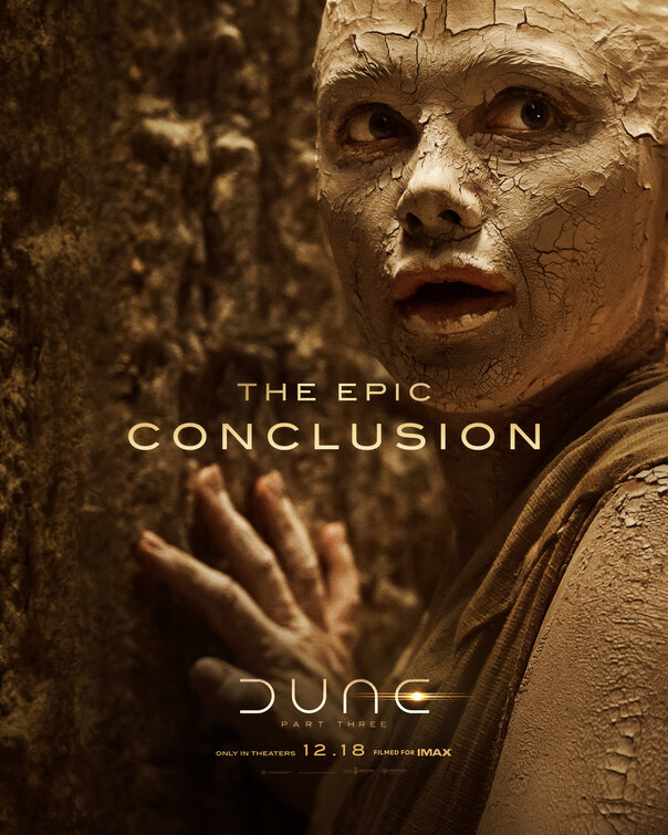
Friday One Sheet: DUNE PART 3

Like everything with WB and Denis Villeneuve's Dune franchise, things are designed and presented with polished perfection.
I do not believe we have highlighted any of the key art from the franchise in this column previously, though. So here we are, with this earth (sand) toned tack-sharp photographic series of posters from Concept Arts.
No credit block, or even 'above the line' credits here. Just a release date, a reminder that it is in the IMAX format, and the promise that this is the last one, or in their parlance: "The Epic Conclusion."
The one thing that I have always admired about the reboot of Dune (and please do not laugh at my nerdiness here) is the fantastic typography design of the curves that spell the title by differing the orientation. It is brilliant, even with the use of the 'glowing desert sun' to make it an "e" instead of a "c." Nobody wants to see DUNC, of course.
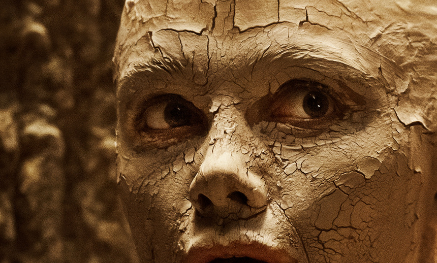
We have highlighted this one below for the caked and cracked mud, the key lighting on the nose and upper lips and brow, and the focus on both eyes, glancing offscreen as well as the hand touching the surface. It is all very textured and tactile, and that is a handsome quality in a movie poster.