Friday One Sheet: THE ZONE OF INTEREST

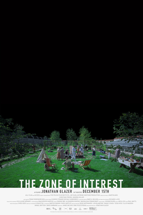
Negative space factors quite figuratively into the execution (as it were) of Jonathan Glazer's magnificently icky, and profoundly disturbing domestic drama, The Zone Of Interest. Design studio Kellerhouse have integrated that into their key art for the film, which features the blackest sky I have ever seen in a movie poster.
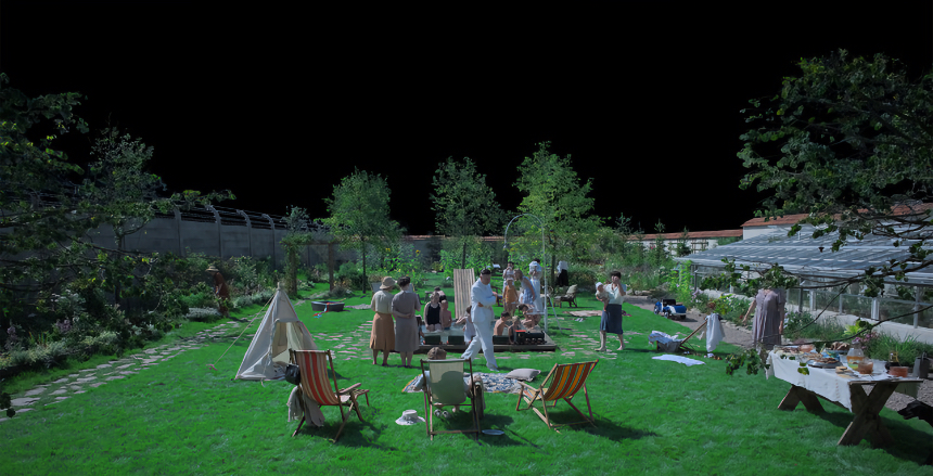
This darkest night lords over the domestic scene of family in their expansive garden. If you look closely though, two figures on the right hand side are missing their heads. This sort of blotting out reminds me of the superb work done on the Parasite key art a few years ago, albeit it was done more explicitly in that one. Weirdly (or perhaps not) both of these posters feature tipis.
The raised angle of the scene here, and the small figures going about their evening leisure with the bakdrop of a barbed wire topped concrete wall, evokes exactly the feeling of off putting sickness that the film allows the audience to dwell. The title card is cut out of the image in a stark off-white, which allow for the credit block to be rather in your face. Like the films of Michael Haneke, audience awareness of things outside the frame of the story is part of what gives the film meaning and power.


