Friday One Sheet: MAKE UP

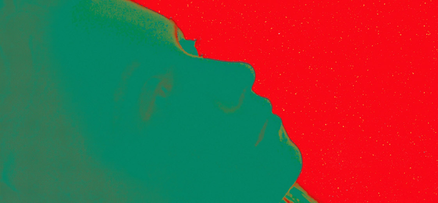
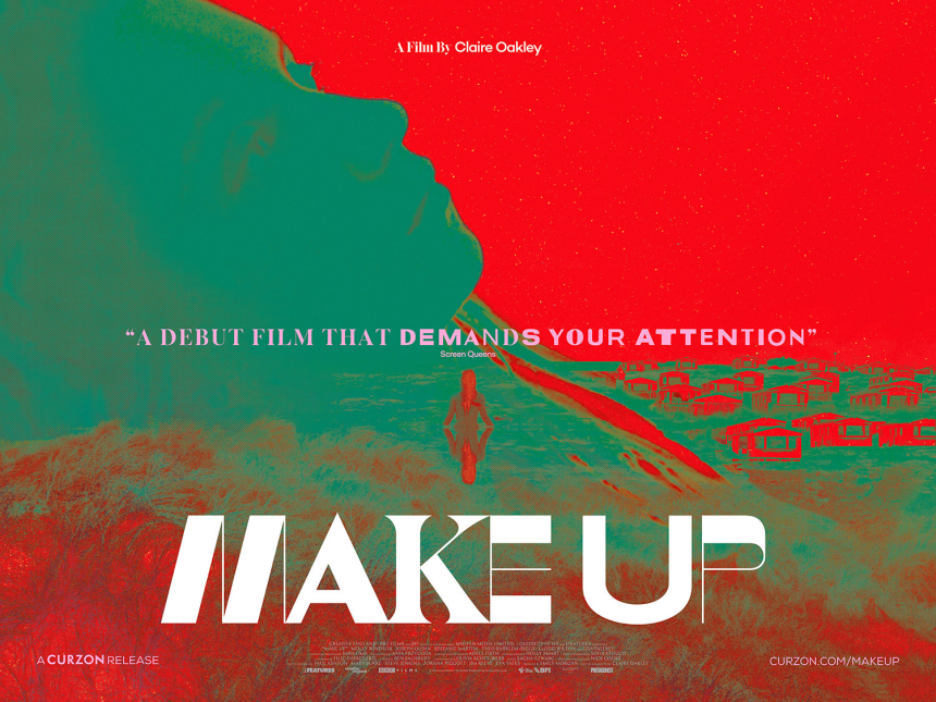
This striking, lo-fi, key art for Claire Oakley's debut feature, Make Up, does unlikely things with colour. Mixing red and green is a one-way ticket to evoking Christmas, but here, it is cosmic and ethereal, like the stargate sequence of 2001: A Space Odyssey.
A British body-horror psychodrama in the guise of a lesbian romance (according to Sight & Sound), the Quad-style poster certainly says, "something's up." Mixing the lead character's form with the landscape, that is both grassy hill and isolated lake. There is a village down below, and the night-sky is an un-gradient red.
And then there is that thin-chunky type set. In general, the skinnier the font, the more 'art-sci-fi' the film (Think Claire Denis' High Life, or Steven Soderbergh's Solaris remake). Here, there the title text is both fat and skinny. As if designer, Andrew Bannister, is using typeface to play with the hybrid notion of the film (and lead character's) identity, as a subtle indicator. That notion may be a bitnerdy, but it is also delightful, to this onlooker.

To give further insight to the films tone and artistry, I have included the trailer below.


