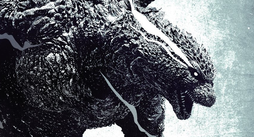
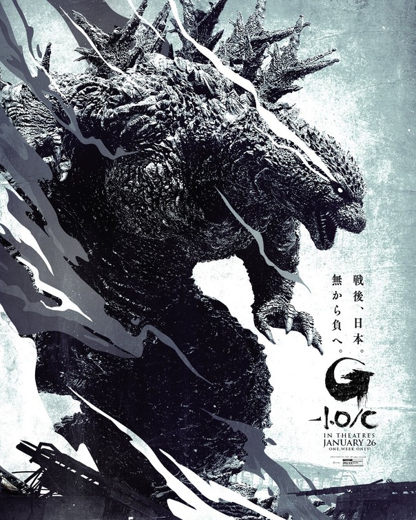
Friday One Sheet: GODZILLA MINUS ONE (Minus Color)

Somehow in this column, I never managed to get to any of the lovely key art designs Godzilla Minus One. Let us fix that, shall we? The Japanese soft reboot cum retro prequel to the 1954 original Kaiju classic has been a runaway global success, and its marketing campaign has been super. In a week or so, there is a Monochrome version of the film being released for a very limited run. And, I do believe, this poster has the best design of the bunch.
Referred to as Godzilla Minus One/C in Japan, Director Yamazaki Takeshi told Fangoria, that Godzilla-1.0/C, is a monochrome cut by cut remaster - with various adjustments making full use of various mattes, composited and edited as if they were creating a new version of the film, "What I was aiming for was a style that looked like it was taken by masters of monochrome photography. We were able to unearth the texture of the skin and the details of the scenery that were hidden in the photographed data."
This is emphasized very well in this version of the poster, where Godzilla is the unambiguous star of the design; all roughness, texture, and smoke. The creature is in a vaguely hero-like posture, which would not be out of place in a samurai film. This is how, globally, we have all come to love the big beast.


