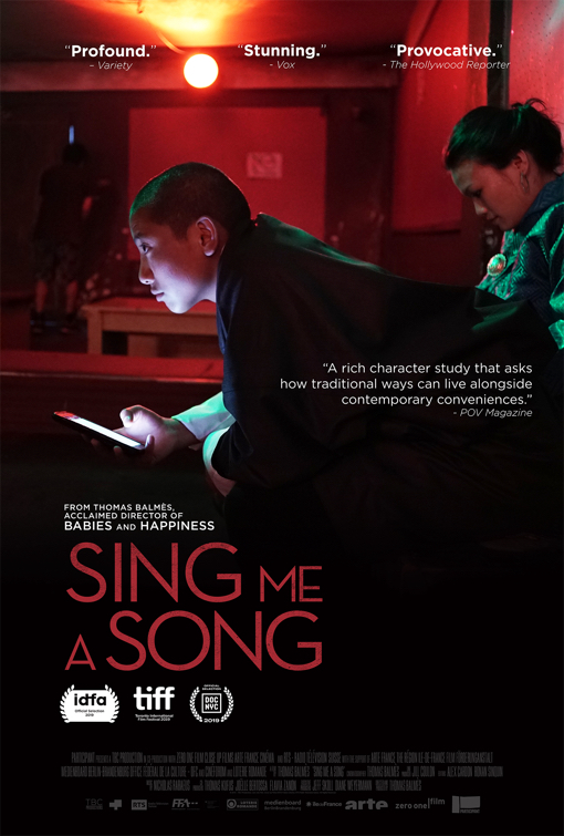
Friday One Sheet: SING ME A SONG

I have written, several times in this space, that many of the best posters are simply a well-designed photo. This is something South Korea designers are known for. A well produced still without the usual clutter, merging of too many disparate photos, or over-design that goes into most modern movie posters.
The key art for this French documentary, Sing Me A Song, where technology allows a Buddhist Monk living in a mountainous monastery to internet date with a barroom singer in the capital city of Bhutan, subtly highlights technology and distraction (note the difference in sight lines from the couple).
It is the red glow of the karaoke bar, contrasted with the green dress, and the huge corner of negative space down in the bottom that is eye catching. Somewhere between the cinema of Wong Kar Wai and Apichatpong Weerasethakul, maybe a dollop of recent Nicolas Winding Refn.
Of course, the designer here did not need to stick a generic pull-quote down there, with the three superlatives already at the top, but I can see how a the corner beckons another deign element. But I digress...
For the record, the original festival poster for this film, is pretty superb as well.


