Friday One Sheet: YEAR ONE

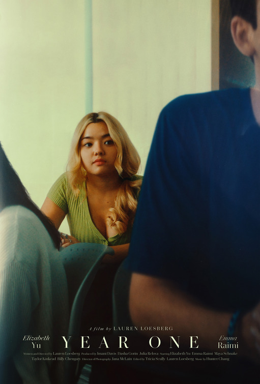
The feature film debut of Lauren Loesberg gets noticed courtesy of this expertly designed piece of key art. Tori Huynh, the designer based out of Los Angeles, has been featured in this column previously this year for her work on Penny Pinched, and at this point, it is fair to say that I am a big fan of her work.
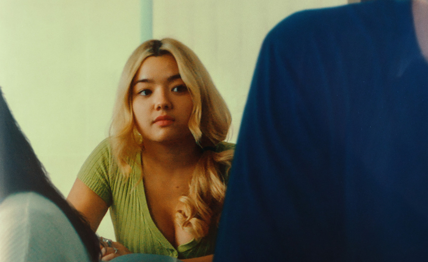
Here, for Year One, a drama revolving around a tough freshman year at college, it is all about the framing. The lead character is shuffled to the background by faceless characters filling up space on either side of her. You not only see the shoulders and parts of their heads, but also the chairs. The lead character, Ruby seems consigned to her place. The large institutional window frames her perfectly. Somehow, by making her smaller in the design, the effect is to make her all the more significant. I cannot quite explain it. This is the magic here.
Down at the bottom of the poster, a very stately (prim and in its place) font for the Title Card, framed elegantly by the director and lead actor credits, stays clear out of the way of the main image. The main credit block is so small as to be almost invisible, which is the state of mind that the key art is striving for in the first place.


