Friday One Sheet: BULLET TRAIN

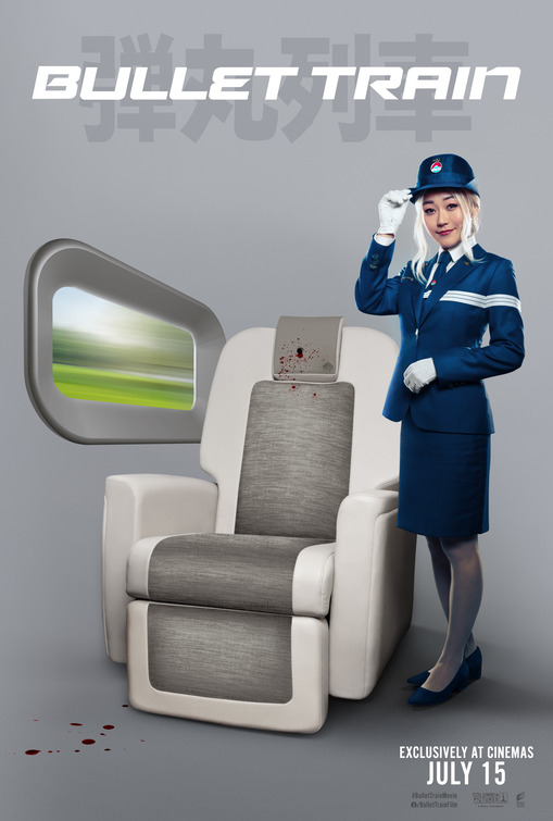
I am highlighting the key art for this Hollywood-Japan blockbuster starring Brad Pitt, Sandra Bullock, and Sanada Hiroyuki because I am not entirely sure if the design house, BLT Communications, was aiming for a Japanese train safety card aesthetic or simply phoning it in on the basis of an obvious pun, and calling it a day.
Bullet Train. Bullet hole. Get it? Have a nice trip. I am surprised this is not the tagline. There is no tagline, nor credit block, making this as much early concept art than teaser poster. Which was then released as a teaser poster.
Either way, the grey minimalism on display here is utterly at odds with the rainbow maximalist candy of the films trailer (see below). Although, the winking-deadpan sense of humour is more or less on point.
I do not mean to belittle design choices, as this column is generally about the opposite, but even a Photoshop novice such as myself could take three pieces of stock clip-art, some blood splatter, a pewter gradient and a chunky font and whip this up in about 30 minutes. That window is in the middle of ... nothing, with the scenery a blurred version of the Windows XP default desktop. The shadows down below indicate a 'corner-wall' that is simply not present. Weird.
Is this better than your typical zero-budget Bruce Willis "Geezer-Teaser" one-sheet, with its floating-heads, and disinterested looks at its intended audience? Of course.
It is still a curious choice for Sony/Columbia to market a big budget blockbuster.


