Friday One Sheet: ENCOUNTER vs. ENEMY

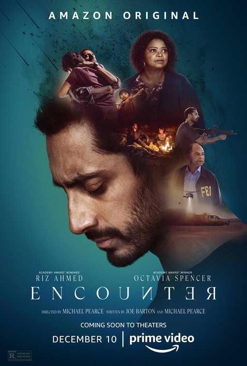
Typically, I have nothing but praise for design house, B O N D. However, today, for their design for psychological sci-fi thriller Encounter, I want to demonstrate how uninspired their compositional riff on a much better poster looks.
So, the plot of Encounter follows a father who kidnaps his children to protect them from a perceived alien threat. The dramatic tension is whether or not this is all in the mind of the father.
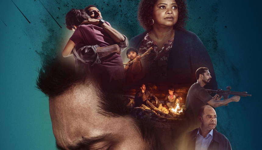
There is nothing wrong, albeit nothing great, by plopping a bunch of characters and scenes into the back space of the star, Riz Ahmed's head. It has a floating head (inside another head) quality. Not a good look. Furthermore, the typography is just lazily slapped on in front, with little sense of placement. A backwards N and R in the title to suffice? The Amazon "Smile-Arrow" is obnoxious on a parcel tossed into a porch, but dominating the bottom of this poster, it just feels egregious.
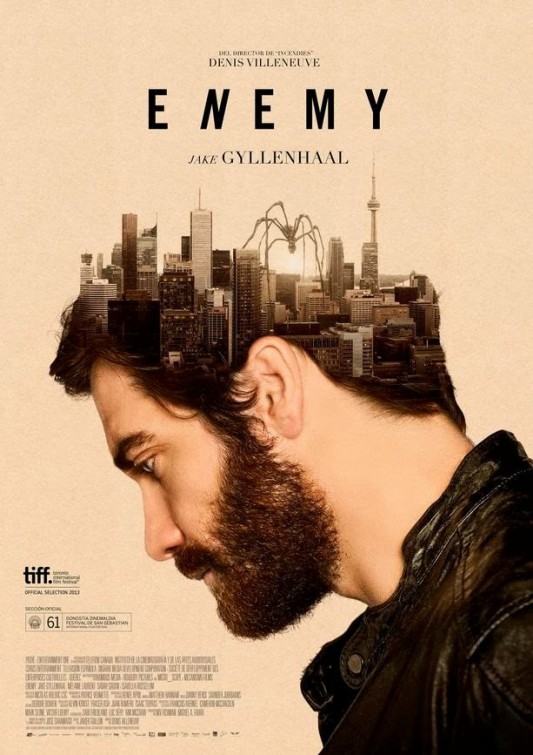
Now, let us consider the inspiration for the Encounter key art. A festival poster from bpg, for Denis Villeneuve's creepy psychological drama, Enemy. The 2013 film made use of the city of Toronto, with its canyon of stone and glass condos on the west side of the city, along with a hazy yellow aesthetic; metaphor, alongside the key visual leitmotif of spiders.
The poster placed the city with a Godzilla-sized spider stepping into Jake Gyllenhaal's grey matter. It was my favourite poster design that year. And there were several great designs for that movie, the smaller indie-brother of big studio release Prisoners.
In general, I would prefer to highlight great and original design on a weekly basis, and for those who missed the marketing push for Enemy, nearly a decade ago, you are welcome for the flashback. Hopefully, it was worth using this column today to point out how not to take a great design innovation, and appropriate it in a rote fashion.

Versus.


