Friday One Sheet: THE HARDER THEY FALL

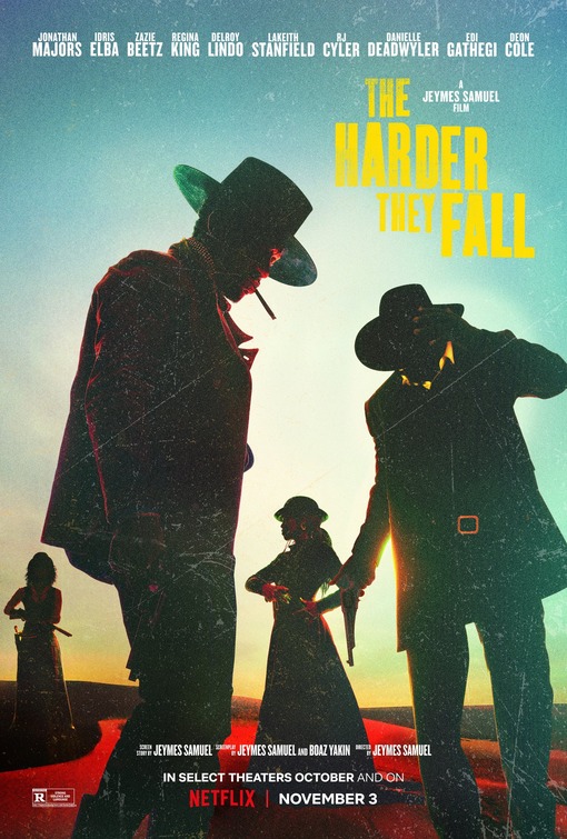
Scratchy, sunset backlit, spaghetti western vibes exude from the key art for Netflix's The Harder They Fall. Even in 24x36 'portrait mode', instead of the typical ultra-wide framing of the genre (or even a UK Quad design), the composition of characters at various distance from the camera (a Sergio Leone signature) give exactly the kind of tone of what one might expect from the film.
The low contrast evening-shadowing, and red highlights on black skin do make the image feel fresh and striking. Thankfully eschewing the 'all the actor's faces in tiny boxes' that usually accompanies poster designs for ensemble pieces, or with a cast as deep as this one.
Because it is a Netflix streaming release instead of a typical film or studio distributor, there is almost no credit block at the bottom, except for the writer and director. I do not know why Amazon and Netflix do this. But they do, even when the streaming services decide to give a short theatrical window, as is the case here. The trusty "R" rating is also noted and logo visible in the bottom left.
Also, as of the past decade or so, fussy fonts are generally not used anymore (not even in genre niches) with designers, as is the case with Gravillis studio here, who favours blocky, serif-free, bold typesetting in hard yellow against the gradient teal sky.
Also, hats. Yes! More hats in movies posters, please.