Friday One Sheet: THE LIGHTHOUSE in Glorious, Stark, Black And White

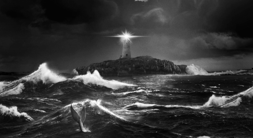
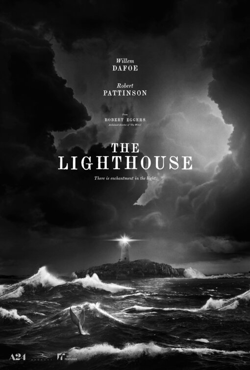
Robert Eggers' Cannes-feted sophomore film, The Lighthouse, gets a gorgeous poster, which matches the high contrast black and white trailer that also dropped this week. (It is embedded below if you have not had the pleasure yet.)
It is rare to see a fully monochrome poster, as most key art firms favour putting colour, usually yellow or red, in the text to make things grab the eye. Much like The VVitch, however, the design here favours a distressed old school printing press typeface, similar to Times Roman, albeit with more exaggerated Ts and Gs (Full disclosure: I am not an expert in this department, if someone can identify the typesetting by sight, please share.) The minimal effect does not detract from the black and white imagery.
Design firm P+A (who are featured in this column a lot) have a winning poster here. Negative (cloudy) space looms large, with a stark, stony peninsula, and the eponymous beacon perched on the rocks, seemingly ineffectual to the harsh waters. And yet there is a fin, playfully (ominously?) gallivanting in the froth.
No credit block for this teaser, just the comforting A24 logo (keep up the fine, edgy work!) alongside Regency and RT/Features. I look for further designs as the film pushes into Toronto, and beyond to a commercial cinema release.


