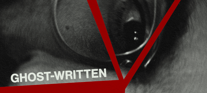
Friday One Sheet: GHOST-WRITTEN

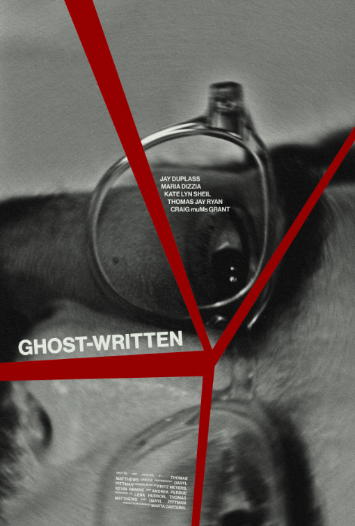
This weeks column features a bit of gritty 70s inspired key art. It gives off strong vibes from Straw Dogs and The Conversation, with perhaps a hint of The Parallax View.
Thomas Matthews' Ghost-Written, follows a one-hit novelist who is out of his depth on a winter residency, and perhaps losing grip on reality. From the writer-director's mouth: "The lack of that perspective in our culture feels fracture and panic inducing. From a bird's eye view it's funny and up close it's tragic. Maybe unconsciously we were shooting for that - as it pertains to our movie. In my very limited experience, the poster will often shape the energy I bring in with me - and as our movie’s a mystery that gets a little high-concept while playfully questioning memory and desire, I thought the audience would have the best time if they came in thinking about nostalgia, ego and solving a puzzle without getting too serious."
Designer David Moragas of Allioli Studio, turns things on its side, has a 'longer, top-down' aspect ratio than your average movie poster. The black and white image contrasted with the fractured red colour offers the design language of 'thriller' with every so slightly a hint of classic Saul Bass designs. Staggering the credit block, the actors, and the title card along these fracture lines not only put things satisfyingly off-kilter, but there is a circular 'spin' to the whole thing which the text accentuates.
And then there is the tiny typeset mystery of Craig muMs Grant...


