Friday One Sheet: Text As Image UNDER THE SILVER LAKE

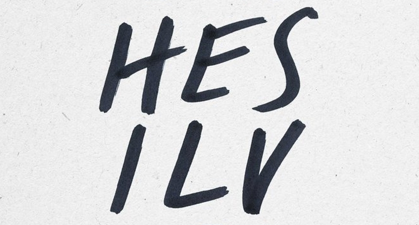
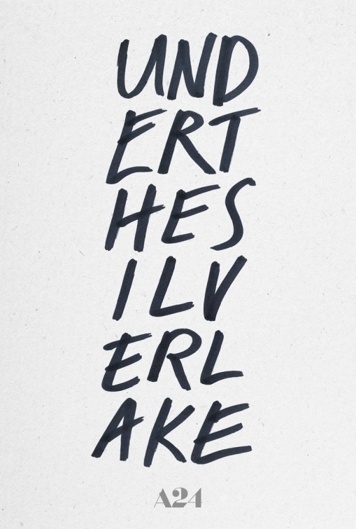
It has been an interesting week in text focused teaser posters, and we have selected the key art for David Robert Mitchell's follow-up to It Follows to capture this. The reason why I love this design (notwithstanding the cliché of large 3 letter columns in the graphic arts) is that it forces you to look closer, almost like the image is a puzzle.
Drawing in someone is the entire point of a teaser poster, be it an iconographic image (the poster campaign for Francis Ford Coppola's 1992 Dracula springs to mind) or a superhero sigil (think the insignias for Batman or Superman) or the mystery-box shenanigans of J.J. Abrams shepherded films. With David Fincher's The Social Network, a new poster design idiom was born by planting text firmly in front of the main character's face. It has been often imitated in the last eight years.
The challenge here is having this teaser connect to the eventual film down the road for someone just walking by in the lobby. Only the A24 logo at the bottom would offer savvy filmgoers a key that this is going to be edgy and possibly leaning towards genre.

As mentioned above, it was an interesting week for text only poster design, note the images for Jeff Tomsic's Tag, Michel Hazanavicius's Godard Mon Amour, and Matthew Miele's Always At The Carlyle all have posters that maximize text and minimize image.


