Have Your Say: About Original Non-original Movie Poster Art...

Newly commissioned covers can be cool, of course, but more often than not they are like fan-art, either not reaching the quality of the original posters or overdoing it (and often spoiling half the film to boot). Sure, many posters for Alien beat the original artwork, but a lot of them rely on everyone knowing by now what the monster looks like. Arrow UK had this thing going where they let people on their forum choose the commissioned art for their new releases, but that almost invariably resulted in the lewdest design winning the battle. So in general, I'm perfectly happy to just see the original poster art, as used during the film's theatrical release.
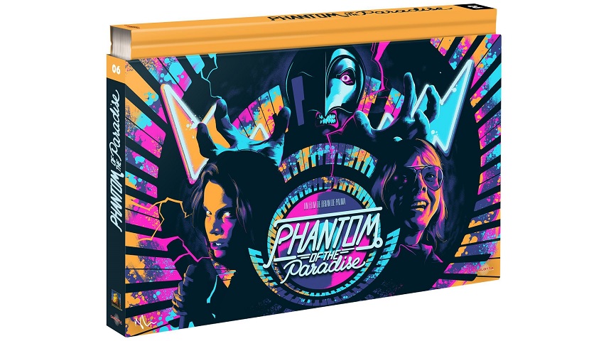
Exceptions always occur though. I mean, check out the art above, for French distributor Carlotta's upcoming Ultra Collector release of Brian De Palma's Phantom of the Paradise. In my opinion it's damn awesome, and I'd sure want this on MY wall (preferably as a blacklight poster)!
It's not the first time Carlotta scores with their commissioned cover art: the first of their Ultra Collector Releases looked pretty fine as well. Also, many people will have fond memories of some non-original VHS covers of that platform's hay-day. And I haven't even mentioned Mondo yet...
So our question of the week is: what is your favorite "new" (as in: not-used-in-theaters-originally) film poster? Which piece of art which struck the right tone and style?
Chime in, in the comments below, and HAVE YOUR SAY!
(Oh, and feel free to post links towards the images.)

Do you feel this content is inappropriate or infringes upon your rights? Click here to report it, or see our DMCA policy.


