Friday One Sheet: THE WANTING MARE

It is rare that a director designs the key art for their film, even in the indie filmmaking world. The last time that I can recall this was P.T. Anderson's design for Magnolia over 20 years ago.
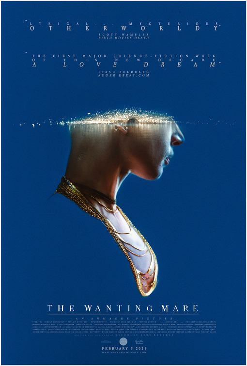
This striking poster for Nicholas Ashe Bateman's The Wanting Mare, was (if I have my facts correct) designed by the director, who wears multiple design hats regardless, as he works as a special effects wizard on films as varied as the Oscar winning Free Solo to the more recent Wendy and the upcoming Green Knight. And is the editor for his own short films and this feature.
But let us look at the design here.
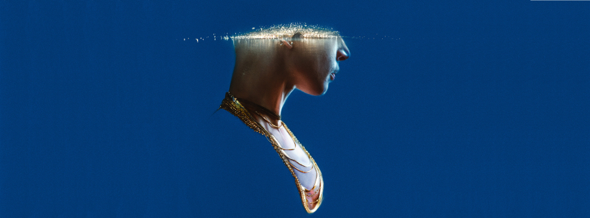
The deep azure, against the dark skin tones and gold highlights. It's hard to look away. The head itself recalls an 19th century Victorian iconography, like a portrait in a brooch. But the head being bifurcated horizontally with motes of light spreading out like ripples on a pond are perhaps the most intriguing element, it screams science fiction as much as the skinny typesetting and unusual kerning of the critics pull quotes above.
More classic and ambiguous is the title card below and credit block below. There is ample use of space around the central image, even considering the splashes of text. By the account of our own Shelagh Rowan-Legg, the film itself is also magnificent.
So is this aspect of auteur marketing.