Friday One Sheet: TO KILL THE DRAGON Festival Quad

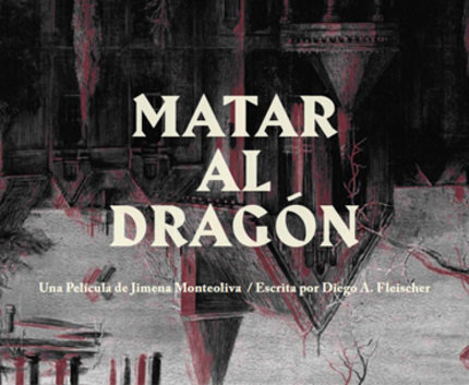
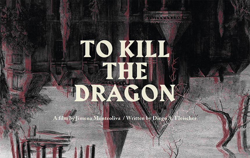
Here is an eye grabbing quad design for domestic horror, Matar al Dragón, from Argentina (and director Jimena Monteoliva, whose previous film, Clementina, was no stranger to good key art).
Houses and homes are often a theme in poster design, particular for horror films. The hoariest cliche over the past 15 years or so is the menacing house with roots growing out the bottom. So it is delightful to see this literal take on a house turned upside down, with a brush stroke heavy hand drawn design.
Also striking is the two-colour palette, grey and maroon, which are out of phase, symbolic that there is to be a surface narrative, and a hidden narrative. It is a highly suggestive, and rather grand in its way.
The quad style teaser poster was presumably made for the festival circuit, as the film is currently playing Mexico City's Morbido festival before heading to Mar Del Plata in Argentina in November.


