Friday One Sheet: Possible New Poster Cliche - The Image Vortex

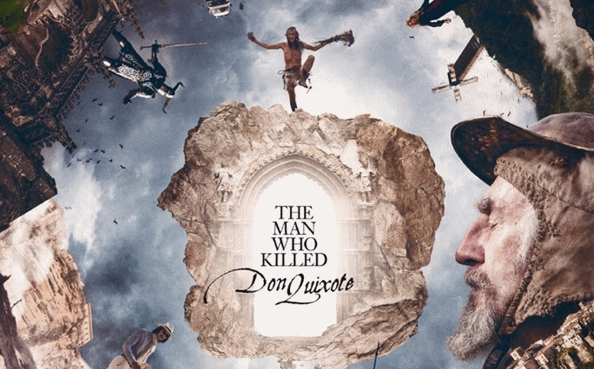
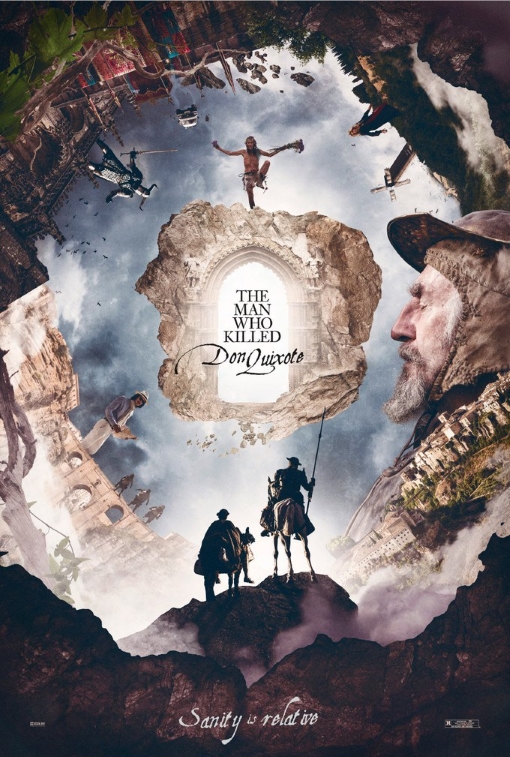
Three data points do not make a trend, and therefore I may be wrong on this. However, after perusing the series of potential posters for Terry Gilliam's The Man Who Killed Do Quixote, one of them stood out immediately as a familiar sight. It is the 'vortex' styled one (below), that features Quixote and Sancho Panza...er...Adam Driver's Toby looking into the spiralled M.C. Escher version of the medieval Spain.
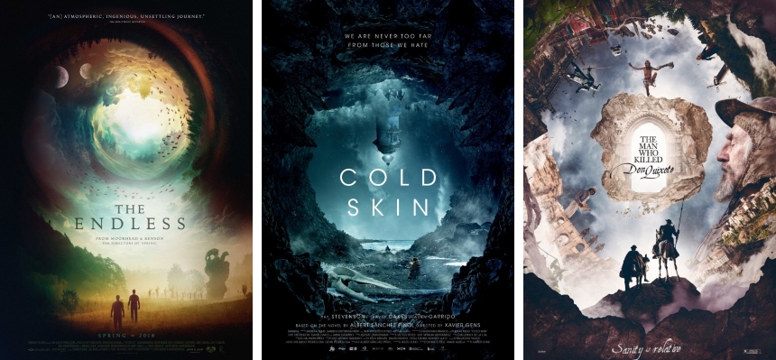
Back in January, when the key art for Justin Benson & Aaron Moorhead's cult drama-scifi The Endless debuted online, there was immediate chatter about how exciting the deign. So much so that a few weeks ago, that when our own Ard Vijn asked the question of 'What is your favourite Movie Poster Of All Time?' as a Have Your Say article on this site, he used that poster, designed by Brandon Schaefer (the man behind such lovely key art for Lowlife, Christine, and 78/52) to kick off the piece.
Last month, I noticed the key art for Xavier Gens' Cold Skin (by Barfutura Creative Solutions) was the cool blue analog to the warm yellow colour tones from of The Endless. Perhpas this was complete co-incidence, as the films are nothing alike, tonally or aestetically. The similarity is nothing so egregious as that trend from a few years ago where so many domestic horror films featured posters with a house with tangled roots underneath.
But now we have this variant of The Man Who Killed Don Quixote appears to be the Earth tone version of the 'Vortex.'

Here are all three side by side. Note that all three prominantly feature the sprial, but have the main characters at the base, and the spiral seems to be a mixture of architecture and geography. Make of this what you will, I don't believe these three films have all that much in common otherwise, but perhaps we are seeing a new hollywood poster cliche in the throes of its birth.


