Friday One Sheet: CLERKS III

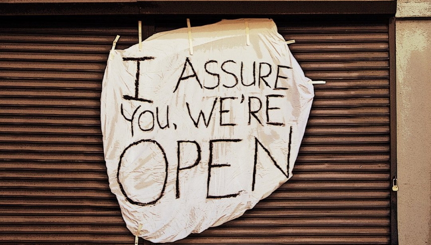
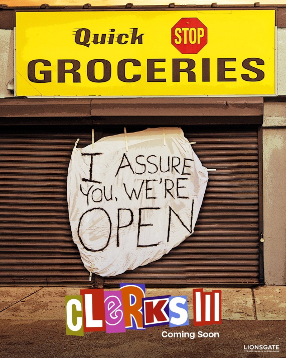
What smells like shoe polish? Allow me to indulge in a little early 1990s American Indie nostalgia with this teaser art for Clerks III. Design house B O N D, have taken some of the key elements from Kevin Smith's seminal New Jersey slacker comedy, and turned them into teaser posters for the upcoming Lionsgate sequel. The original film was a product of the peak Miramax era, at the dawn of the commercial internet and film-nerd Usenet news-groups, and made its poverty stricken film school dropout writer-director-raconteur an instant hero of that set.
There have been cartoons, comic books, and a 2006 feature sequel, Clerks II, as the franchise has been a sort of cottage industry for nearly three decades, so seeing the Quick Stop convenience and grocery in colour is nothing new. Nonetheless, the white sheet with shoe polish, "I ASSURE YOU WE'RE OPEN!" brings back memories of dank repertory cinemas that paid their bills by screening the original Clerks (along with Austin, Texas set Slacker, directed by Richard Linklater, and Reality Bites, directed by a young Ben Stiller) on loop in the mid 1990s.
Indie cinema of the era aside, some curiosities about this key art design include the odd aspect ratio. I have no explanation as to why it is a few percent 'wider' than this types of 0.67:1. Also, there is a queer sort of grain to the image, which may be an attempt to hearken back to the high-contrast, high grain black & white stock the original was shot on. Finally, there is the original "ransom note" Clerks logo from the first film's key art, done in a slightly more saturated palette, with the additional roman numerals (as God intended sequels to be).


