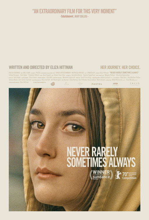
Friday One Sheet: NEVER RARELY SOMETIMES ALWAYS

With a healthy respect for negative space, youthful skin and earth tones, the key art for Sundance winner, Never Rarely Sometimes Always, succeeds in its own minimalism. There is not even any punctuation in the title.
Gazing directly at the viewer, the framing and the mood captured in lead Sidney Flanigan's visage evokes a contemporary take on Vermeer's The Girl With The Pearl Earring; sans jewelry, but with hoodie.
Credit block in the middle, and clean type-face of the title, whose placement draws attention to the face, almost like a scarlet letter or prison tattoo. The film is about an unwanted pregnancy and a young girl looking to get an abortion in rural America.
I know that posters need pull quotes. It is a time honoured tradition, but I feel this one could do without the nothing-burger of a pull quote here, to preserve the pleasurable negative space at the top. Perhaps that is the purist in me talking here. It is a great poster, and I wish there were more like it in the American Indie space, or otherwise.


