Friday One Sheet: A SIMPLE (Thai) FAVOR (Again)

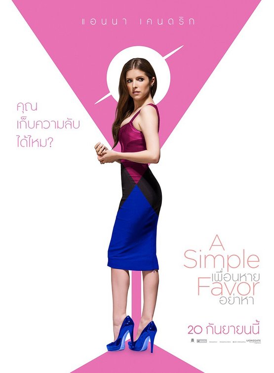
A number of weeks ago, we slathered on the love for the pastel geometric key art designs for Paul Feig's mystery thriller, A Simple Favour. As the film gets an international push, there has been consistency in the marketing campaign, and if anything international designers are taking things in further, even more satisfying directions.
The film has been out in North America for a more than a week, and is getting very kind reviews, including our own Jim Tudor who sums up the film, "What begins as a curiously percolating character study gives way to an engagingly convoluted murder mystery before settling into a mile-long explanation and frankly nutty resolution."
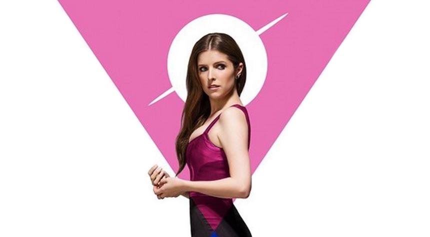
Back to the poster: Consider the martini glass here, and how it fits into the cut of Anna Kendrick's dress. Consider how Kendrick's magnificent footwear stand on the base of the glass. The dual triangles are matched with the angles in her dress, and the white background is shorn of the usual credit block for a simply a release date, and a few nods towards the actors and tagline (I am guessing) in a rounded sans serif font. The poster looks almost retro-future, and is devoid of all the usual 'photo shop touches' that tend to make most key art generic and boring. The entire marketing campaign of this film has been exemplary.


