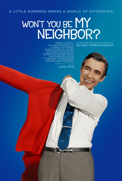
Friday One Sheet: WON'T YOU BE MY NEIGHBOR And The Halo Gradient

The first time I saw the 'halo gradient' character poster was in the marketing for Judd Apatow's The 40 Year Old Virgin. Since then, it has become kind somewhat of a key art cliche. This is mainly due to the 'angelic' aspect it imparts on its focus subject. (Notably: Steven Soderbergh's The Informant! effectively picked up on this attribute and subverted it.)
But along comes Morgan Neville's astute and emotional documentary on TV personality and all around nice guy, Mister Rogers. Combining his incredible empathy, passion for treating children with dignity, and radically unafraid to address issues both timely and universal, like everything else Fred Rogers, this poster for Won't You Be My Neighbor is unapologetically earnest.
My only gripe here is why the designers, Arsonal, did not use the iconic Bookman font variant that was used on Mister Rogers Neighborhood for most, if not all of its 35 year run on PBS? Instead the firm chose a rather ugly typeset that subtly threatens to undermine everything else that is great here. A minor thing, but the details matter.


