Jason Gorber's Cineruminations: 70mm, 4K, and THE MASTER's Split Personality
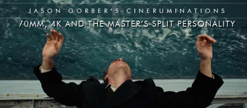
Ever since Paul Thomas Anderson announced that he'd be
shooting The Master for large format celluloid presentation, many of us have been drooling at the prospect of a modern, epic 70mm masterpiece slipping
out of Hollywood.
It's been 16 years since anyone had the chutzpah to shoot a feature film on 65mm neg (Kenneth Branagh's Hamlet for those keeping track), and given PTA's proclivities for all things analogue, this bravado move seemed a natural fit.
When it screened at the Princess of Wales theatre in Toronto, using decades-old projectors rescued from the Cinesphere (the world's first IMAX theatre), it was a fitting marriage of the technology of large format presentation with a venue slightly pretentious, certainly ornate, and ripe for a fine cinematic experience.
I sat in the second row in order to best experience the vastness of the film, and waited through the pre-screening trailers for the 1.85:1 screen to suddenly open, the curtains splaying for the full 70mm experience.
They never did.
 For reasons that are probably PTA's alone, the film is shot for
70mm, which has a very wide aspect ratio normally, yet The Master has
been reframed for 1.85:1. This is essentially the aspect of your widescreen
television, or even most smartphones. Essentially, we've got a film shot for
70mm, with the sides cut off, akin to what Tati did with Playtime.
Ignoring the slight shock at the aspect decision, seeing the film on that screen was certainly wonderful - the colours in particular are exquisite, what I referred to in my review as a "Kodachrome pallor" making everything seem a bit more teal and beige, a bit more retro. Reel changes were marked with cue marks (affectionately known as "cigarette burns"), those hole punches in the top right corner that somehow made the film seem that much older. There was a bit of analogue shakiness to the presentation, but it was minor. Even at that close distance, grain structure was almost non-existent, except for a few cases where it would erupt (more on that later).
Days after TIFF ended, I had the chance to see the work
again, this time projected from a 4K DCP on a newly-calibrated projector.
The differences in presentation were there, but they were subtle. The image on
the (larger) screen was slightly darker; in scenes inside the hold of the ship,
for example, when Joaquin Phoenix is mixing his drink, it's hard to read the labels
on the containers.
The clarity compared to the 70mm presentation was at least equal -
there were no bands, jaggies, digital noise, or any of that ilk that plague
poor digital projection. The same astonishing depth you get in the opening
shots of that teal ocean looked as good in 4K as they did in 70mm.
In fact, in some ways the film projected from a datasource looked objectively better - it's a clearer presentation of the grain structure, there was no flickering of the image, no jittering of the print passing through the projector's gate. Of course, we also didn't have any of the cue marks - the film played in one continuous flow - nor did we have that almost subconscious flicker from the shutter that you get with even the best analogue presentation.
The "problems" that were maintained in the 4K presentation is almost more interesting than what was absent. You still had the beautiful close focus, narrow depth-of-field shots that you get by using camera equipment designed to capture on 65mm film. You have almost all the advantages of shooting for large format negative, and none of the apparent disadvantages of projecting it. What was perhaps most telling, however, is that you can still see dirt on the 4K "print". Occasionally, black specks creep into the image, little bits of grunge that keep the image from appearing pristine.
This was very confusing.
To get some answers, I turned to the person who knows more about 70mm than almost anyone. Robert A. Harris has spent decades helping to rescue some of the most important
films of all time. His work on restoring Lawrence of Arabia is legendary, as well
as on films the likes of Vertigo, Rear Window, My Fair Lady and the Godfather
series, and many others. While Robert has no direct connection with the
production, I thought he'd be a great person to bounce some of these questions
off of. At the very least, while he has yet to see the film, and has no inside information on the production, I knew that his guesses would be educated ones.
First of all, there are some confusing things about large format analogue. The negative you actually shoot on is 65mm in width. You then print that negative on 70mm film stock. As Harris explains, the 5 perforation high image has an aspect ratio of 2.28:1. However, "the way that it was run in the 50s, 60s, 70s and early 80s, with magnetic stripes carrying the audio, was 2.21:1, because the magstripes covered the edges of the film."
I asked, then, about how you shoot for 1.85:1 on 70mm? His answer was simple: "If the decision was made in pre-production, you put a mask in your viewfinder." In other words, while the negative afforded a wider rectangle aspect, PTA and crew would be composing shots knowing that they'd be essentially extracting out a centre portion of that frame in order to present the film in the way that they chose.
I asked Harris whether it would make sense to "pillarbox" the negative, essentially vertical letterboxing the side of the negative. "No, you shouldn't. You want to protect for 2.21. If you don't protect, and you have a problem, you end up saying, 'boy, I wish I could move this to the left, just a little!' If you mask your negative, you can't. There's no reason to mask the negative. If that black matte that's printed on the side, is scratched, you're going to have green lines running down the side of the screen. The best way to do it is with a 1.85 aperture plate, the way that E.T., or any of the 35mm blow-ups were run."
In other words, a metal aperture plate is put into the projection system, blocking off a portion of the material on the negative itself, with a slightly smaller "window" through which the less-wide rectangular image is projected.
In The Master, there's one confounding shot in the middle of the film, where the aspect ratio seems to shift. It's a scene of Hoffman at his desk, Joaquin on screen right, and the tops and bottoms of the image are dark. On both screenings it seemed like this was an arbitrary nod to the wider aspect, but according to other sources close to the production, it seems this may simply have been the way that PTA framed that particular shot (rather than, say, printing back a 2.35 image within the 1.85 shot for that single instance). Until we get a formal breakdown on that particular shot, we may never know.
If it was in fact a different aspect shot, Harris suggested two ways that could have been accomplished. They could have taken the 1.85 image and reduced it vertically, or they could have printed the 2.35 image inside the 1.85 frame. Our third option, that maybe a lower ceiling or shooting through a bookcase or something might account for this visual nod to the "normal" way we think of 70mm presentations.
One advantage of 70mm widescreen is that it doesn't need to use "anamorphic" lenses. These lenses squish the image horizontally on the negative, and then when projected back through just a lens stretch the image back out. Without going too far down a rabbit hole, you can think of a 35mm neg as basically being close to 1.19 without the track area, a format that goes back to the pre-Academy 1930s, then having a squished image put in that frame. Projected with anamorphic, the image widens out to 2.39. For 70mm, you're capturing at a "native" aspect of 2.28ish, making the decision to then go back and do a 1.85 "crop" even weirder.
(On a side note, 70mm can also use anamorphic lenses,
making for a similar 25% gain in width via the anamorphic "squeeze." That's how
films like Ben Hur, shot on "Camera 65," or It's a Mad Mad Mad Mad World on Utra-Panavision 70, end up with ludicrously
wide aspect ratios like 2.76:1). According to Harris, in most cases these films were projected closer to 2.55:1.
This entire discussion of aspect ratios and the like
involves the capture of the film's images. There are unique optical
properties to capturing on wide format negative that 35mm simply cannot do in
quite the same way. A 35mm 1.85 shot and a 1.85 shot from 70mm look different.
They exhibit different levels of grain, the lens kits are different, the way
that focal length and depth of field can be maintained is different, and so on. Part of what makes the film so remarkable are the extremely tight shots of faces, the features of the protagonists dancing in an out of an extremely tight focal range, with the depth of field falling off to bokeh in a super pleasing way. This is the unique advantage of shooting for 70mm presentation, being afforded an entirely different kit by which to capture some of these stunning images.
Still, not everything is as it seems. Turning to other sources familiar with the production, they confirmed the info listed on IMDB, namely, that not every frame of the film was shot on 65 neg.
Those scenes where the grain suddenly erupts I alluded to
above are almost certainly the segments captured on 35mm. I asked my sources about one key scene when this occurs (where
Joaquin is running away from the farming village along the field), a scene shot
in very low light at what looks to be pre-dawn hour, and it was confirmed this was a shot captured on 35mm. The reasons for this hybrid are manifold, from potential problems with the bulky large format equipment, or shooting in either lighting or environmental conditions where 35mm makes the most sense. It's also possible that Anderson and his crew simply wanted some shots to exhibit different characteristics, in much the same way as he often uses different emulsions to create changing moods throughout his piece. This is not a unique phenomenon, - as Harris points out Ron Howard did much the same thing on his 65mm production of Far and Away - but much like debates about 3D native vs. post conversion (where even in-camera 3D films often have significant manipulation after the fact), thinking of The Master as a film purely shot on 65mm neg isn't quite the whole story.
On both digital and analogue projection, the differences in these occasional shots, in contrast to the majority that's captured on 65, is startling. That said, if the intention all along was to incorporate both 35 and 65 negatives into the single work, then the lowest common denominator in terms of aspect is, again, 1.85. Whether on the basis of aesthetic or technical considerations, the reasons that PTA chose this aspect remain his alone.
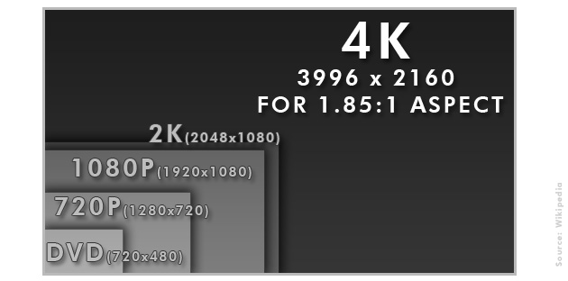 So, given a myriad of reasons that one might want to capture
images using analogue technology, I put the question to Harris directly - provided that the projection systems are properly calibrated and there are competent operators at the controls, what are
the advantages of projecting 70mm versus 4K. He responded bluntly, "None
that I can think of."
Harris states that with analogue, "you're going to get bob and weave," you're going to get certain projection artifacts, and we both agree that "maybe that's what the director was looking for." The inclusion of cue marks, the other aberrations that we take for granted even in top notch digital projection, are there, are part of the character of what we consider to be (vintage) film presentation. Like those that prefer vinyl to high resolution audio (or even magnetic master tapes), these are sympathetic distortions, things that some prefer to be there even if they're mere artifacts that can easily be compensated for.
This, then, is the crux of what's at stake here - even if one accepts that shooting on large format celluloid gives you something that no other capture format could, does that then necessitate you project the film in that way to get the full experience?
As always with this project, that question has no easy answer.
All things being equal, the 4K should be able to properly convey an image of equal (or better) quality and character.
 I asked Harris if he saw the need in 20 years for analogue
film projection: "No... Well, except in archives." Does he expect in 20 years
people will still be capturing images on film? "No. Fuji is going to stop making
stock in March. No more Ilford, no more Agfa." In other words, it soon won't be
possible to shoot on film.
Harris continues, "Every day, Kodak has less of a rationale to keep making film. I don't see Kodak making stock in 20 years. But, I don't say that's a good thing. Film still works better for some productions. On top of that, we would lose the ability to archive productions, whether shot on film or data, as film. Film is robust. Data is fragile. You can still take a piece of 35mm film that is over 100 years old and print it. Do you really want to entrust your multi-million dollar production to a bunch of 0s and 1s that have to be migrated and cloned every five years? I find the thought frightening."
While we'll lose something quite fundamental by not being able to shoot on film, I asked Harris whether a competent digital projection can replace analogue projection: "Yes, if the theatres hire proper projectionists and keep the equipment up properly." Asked how he'd rate the current state of analogue versus digital, he admits "they can both be pretty bad. I don't enjoy going to most movie theatres, I don't enjoy going to movie theatres because normally the picture looks like crap. In some major cities you can still find quality projection, but not a lot of it. When I'm in LA, I see everything, I go to the Academy, where everything is perfect. Fortunately, that's one city where you can still find perfect projection if you know where to look - venues like The Egyptian and others."
Given all these caveats, given calibrated projection equipment, competent projectionists and the same source, I put it to him - all things being equal, would he go to a 4K projection or a 70mm projection: "I'd go to 4K. I'd do that for a couple of reasons. You've got a digital projector, and a pair of 70s sitting right beside each other, same venue, same screen. The 4K is a datascan from the original camera negative, or pure data. The print is either 65mm negative printed to 70mm print, which is fine, but down a generation, or a 4K scan, recorded to a 65mm negative, printed to a 70mm print, and at that point you not only have decreased resolution for the print, sometimes by as much as a third, you are losing even more via analogue projection."
I asked what format Harris thought David Lean would prefer for the upcoming Lawrence release: "I think he'd prefer data. He was a perfectionist. I believe both he and Freddie Young, his cinematographer, would be amazed at the new digital version that Sony has created."
 So, where does that leave us with The Master?
Traditionally, filmmakers did whatever they could to push the technology of filmmaking forward. PTA is simultaneously showing what we're losing in large format capture, but also illustrating some of the inherent flaws (or "love bites," as Midnight Madness programmer Colin Geddes calls them) that are a part of analogue projection.
There were interviews and press reports during the run of There Will Be Blood where PTA admitted to being a "Luddite," and eschewing Digital Intermediates and colour timing his film using traditional methods. This is the in-between bit, the crucial stage between what's captured and what's projected.
Before computer colour timing, a film would be captured on negative, but the way the image would actually look would be influenced by a number of factors that would be carried out during processing. The filmmaker could push a film's luminance, increase certain colour channels, even do radical things like bleach bypass (think Se7en) in order to make the film look a particular way.
With O Brother, Where Art Thou, the modern age of DI's came into being, where filmmakers would scan their negatives and basically "process" the film within a computer. You could then take a portion of the image and tweak it, leaving part of it warm, part of it cool, without ever modifying the actual neg. You would then laserscan back to film the DI'd image, thus creating a new, pristine negative.
One could guess by the fact that there's a 4K presentation of The Master, and based on the info in IMDB, that PTA's film underwent such a process. Furthermore, there are a number of (subtle) effects shots, including one where eyes change colour within a scene. Any effect shot that goes into a computer would, of course, needs to go through this scan/manipulate/output procedure.
Furthermore, doing a full DI would better accommodate the 35mm elements, where you'd have a single ingestion of the smaller negative, scaled up in the computer, thus using digital methods to conform the grainier image to the 70mm print.
This does not seem to be the case. According to these sources, it sounds like The Master really has two forms, two ways of being.
The 4K presentation was done via DI. This is the format that will be used for the Blu-ray, and for general 35mm release prints. This is the "digital" master, based on scans of the original negatives and timed to look the way he wished it to look.
However, this is metaphorically like the Beatles' early stereo mixes which were secondary, almost afterthoughts to the original Mono counterparts. For, according to sources, Anderson in fact produced a conformed negative for use in 70mm printing. In other words, the 70mm print (as well as a few select 35mm presentations) are based on an analogue, DI-free negative.
There are two masters for The Master, one digital, one analogue.
Based on this information, it seems that the analogue negative is the source that was used as the basis for colour timing the digital version. These two versions are very, very close, but of course can't be identical. If the 70mm was simply a laser output from the 4K DI, there would be little doubt that the 4K would be closer to the (digital) original. PTA could have gone the other way, timing the negative, then scanning that into 4K without doing much additional manipulation. It seems, if sources are to be believed, that the process was done in tandem - one for digital, one for analogue. Similar, but not exactly the same process, this is a film with a split personality, different depending on how you see it.
Like the film itself, things are a lot more complicated than they first appear.
 There will be subtle differences, then, between the 4K and
the 70mm inherent in the different processes, differences that could very well account
for some of the luminance changes that I noticed in the 4K presentation. Again,
I have no access to the original materials, and there could be a slew of
different reasons for the apparent discrepancies, from projection calibration to the screen size to incomplete memories of the earlier presentation. On the other hand, the subtle differences
between a chemical and a digital process could very well account for the "same
but different" characteristics of this particular film, the story of the DI vs
photochemical timing could leave out important details or could be aggrandizing
the differences. Regardless, these are two essentially different facets of the
same thing, and it's near impossible to say that one's superior to the other
without taking into account these differences.
What of those black specks that were part of the 4K presentation? If the film was DI'd, why would they still be there?
Quite simply, they're there because PTA wanted them there.
It's gunk he either added, or at least allowed to stay, built into the digital master as artifacts of the process. This is the cinema equivalent of leaving in easily removable tape hiss, or worse, adding in the sound of vinyl pops or cracks in order to come across as "retro." In certain scenes (the "blinking" test is one), in both presentations, you can hear the wheeze of the camera chugging away. This is a filmmaker not afraid to show the seams of his process, and while reluctantly creating a digital "print," he nonetheless left in a number of these quirks of analogue filmmaking to make it appear a bit less ... perfect.
Going further, PTA could easily have added the cue marks as well to the 4K, added bob and weave into the digital source so that it to exhibited all the "flaws" inherent in film projection. He went part way, but not all the way there, still crafting a near pristine digital master that does a more than satisfactory job of presenting the film in its best possible light.
Let's be frank - PTA wants you to watch this thing in 70mm. He's been touring cinemas personally checking to make sure the presentation is up to his standards. This goes well beyond any technical or demonstrable advantage to the analogue projection, this is a fetish, pure and simple.
Of course, this is a fetish I very much share with him.
Still, it would be silly to decry the state of modern
digital projection in favour of 70mm simply because you prefer the distortions
inherent in the latter. It's certainly a hell of a lot easier for you to be
able to find competent 4K presentation in your area than 70mm, and it makes more sense from the perspective of a person seeing this film weeks or
months after it first opens - the $170,000+ print cost means it's not exactly
going to be replaced if it gets the inevitable scratches on it. The DCP will play perfectly, under ideal conditions, if it's the first or thousandth time it's being screened.
The Master is a film without any explicit answers, so it's fitting that this analogue/digital divide is but one more thing that's perplexing about the film. It's an astonishing work visually, and if you have the chance you should most certainly try and see it the way that PTA wishes you to. That said, if 4K is available, I'd recommend choosing it for your second screening, seeing the differences for yourselves, judging on aesthetic grounds which presentation is best able to convey the stunning images.
Save for those still carving out films with portions shot on
IMAX, The Master does seem like the end of an era, but it's hardly a
straightforward ending. There will be a time, not so far from now, when even
capturing this movie on film will be an impossibility. This, by any measure,
will be a shame.
For now, we have PTA's film to help us revel in the wonders of projected cinema, be it digital or analogue. Like those IMAX spectaculars, what's not up for debate is that the film benefits tremendously from being seen on a giant screen. Both 70mm and 4K afford the ability to project cleanly on even monstrous sized screens.
Despite my challenges with the film's plot, what's not up for debate is that The Master is a film that demands to be seen. More than that, it's a film that demands to be seen on the big screen. Anderson is baiting the public with a 70mm presentation, of course, but in getting cinephiles to go out and see this "roadshow"-style presentation he is to be applauded. It's entirely possible this may the last time we collectively experience a contemporary work shot on large format negative that's not some IMAX action extravaganza, and it's certainly a worthy enough project to celebrate for this reason alone.
We're living in interesting times in the ongoing story of the moving image, and in many ways The Master helps expose both the history of quality presentations and the future of audiences going to the theatre to be swept away by the work of a fine director.
Thanks once again to Robert A. Harris for his invaluable assistance with this article
Update: October 1, 2012
- Firstly, as noted in the comments below, there are a number of elements that I discussed in this article that have subsequently been commented upon officially. This article by Kodak details that at least 15% of the film was shot on 35mm, including handheld shots, and this article provides further, on-the-record confirmation about what I reported above regarding both the 4K and 70mm workflow.
- I pegged down the scene where I think the sound of the camera is still in place over dialogue: It's one of the early interrogations in the military hospital, where an officer is directly asking Quell about his feelings. The sound might be something as innocuous as a fan or an air conditioning unit, but the throb certainly sounded to me like the movement of film through a camera rig. Later sounds in other close-mic'd environments (aboard ship, for example) may well be put down to the sound of the tape recording, but this is one instance where I believe we have, either left in or purposely placed, the very "analogue" sound of film run via sprockets through the mechanism of a 65mm film camera
- Beside the running-through-field shot, I noticed more this second time on film, third time through certain shots that were softer than others, almost certainly indication of other scenes where 35mm was used and then blown up for 70mm theatrical presentation. A definitive list will certainly be compiled by some stalwart person, but there were clear shifts in clarity that were not simply accounted for by low light environment or focal issues.
- I'm not, nor have I ever been, a professional projectionist. That said,
I'd be mildy surprised if this is the usual procedure for masking the
70mm image for 1.85. As I indicated above, usually a metal aperture
plate is put in the projection system to block the sides of the image.
While leaving the theatre (the Varsity in Toronto), you walk right past
the projection booth. I took this image:
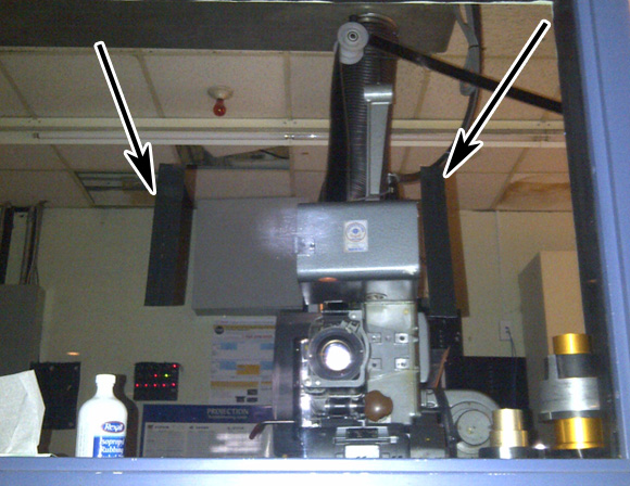
You can see above the strip of film being threaded from a spool on the top right corner, with the arrows point to black tape that is masking the image being projected (those are the end credits being shown as the white blob in the middle). I was sitting in the 4th row, and could see through much of the film some leakage on both the bottom right and top left of screen - seeing this rumpled tape that seems to be the sole device used to mask the image, I'm a little less surprised to see these aberrations. The fact that we also had a building wide alarm test, and that the majority of the audience who had paid a premium to see the film on 70mm and still sat at the back rows of the theatre, added up to a slightly less than stellar presentation.
- Finally got my head around that one shot that appeared to be a 2.28:1 shot reframed within the 1.85:1 image. The scene takes place just before Dodd is about to introduce his second publication. The scene is composed as a 2-shot, with Hoffman on screen left in a chair, and Joaquin on screen right. On my first two screenings, I had thought this a single scene representation of "proper" 70mm aspect. That may well be the case, a clever little nod from PTA, but what it really is is a shot through a window. The top of the "letterboxing" is formed by a pull down shade (you can make out the ring used to pull down the blind), and the bottom edge is set by the window frame. You can actually see out the window of this office into the main hall a few scenes later, just after the (extraordinary) shot where you see Hoffman collecting his thoughts before confronting his audience.
- All technical quibbles aside, the film continues to grow on me with each viewing, and certainly can stand up to these type of repeated screenings. The dream-like images, the powerful performances, all contribute to one of this year's must-see films. I still don't know that it all adds up to much, but it's definitely a movie that demands to be experienced on the big screen.


