Friday One Sheet: A Tale Of Two Posters

Consider this column, one of the last before the year-end round up of 2020s key art designs, a lesson on what to do, and what not to do in all things One Sheet. Here, we have two posters for a violent 17th century domestic drama, Fanny Lye Deliver'd. We will get to the title in a moment.
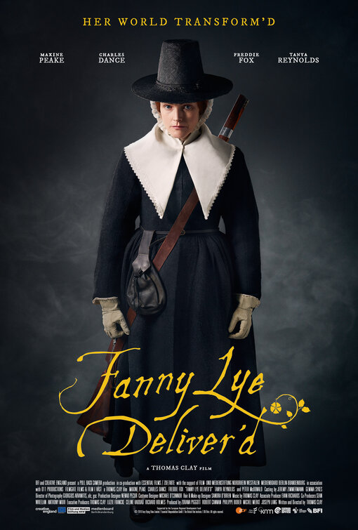
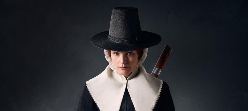
The design features the lead actress, Maxine Peake, in the glorious costume design of the film. Puritan-chic, if you will. She is brandishing a hat, gloves and money-purse, as if ready to travel (or escape), and there is a musket strapped over her shoulder, subtly indicating that there will be violence. She seems to be in a portrait studio, on display, and her facial expression is flat, as people, a few centuries later mind you, posed for photographic plate exposures.
The distressed early-print-press typeface cues a filmgoer of astute period cinema towards the A24 designs for Robert Eggers' The Witch and The Lighthouse. There is the tagline, which echoes the title with its contracted past tense. Both are in tasteful shade of yellow, one that pops off the more muted, shall we say, puritanical design. Excellent work all around. A job well done!
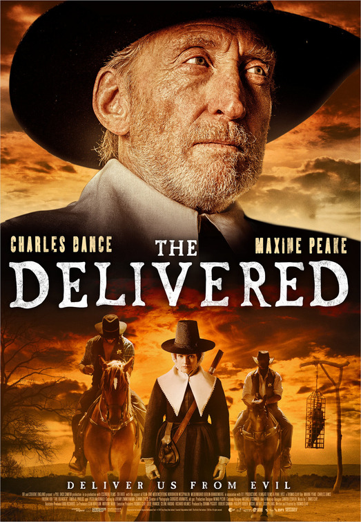
Further below, we have a monstrosity. A travesty of poster design. Now, I love Charles Dance, and his on-brand visage of disdain, as much as the next guy. I have been enjoying the resurgence of his career since he popped up in the first season of Game Of Thrones, right up to his recent appearance in David Fincher's Mank as arch-enemy William Randolph Hearst. He clearly is the biggest name performer in this relatively small UK/German co-production.
However, putting him, floaty-head-style, at the top of the poster, like the film is already resigned to the Walmart DVD bin, seems bonkers, to me, in 2020. Are there even these sorts of rack-focused retail in Walmart or grocery store -- the pragmatic raison d'etre, for those floating head designs in the first place -- these days? It is all streaming and boutique physical media releases at the moment. A garish, mercenary act of marketing so cruel has little reason to exist.
And then, they go ahead and change the interesting title. Fanny Lye Deliver'd draws a potential viewer in, with its curious diction, and its archaic presentation. The newer design, which appears to have been tossed off over a cup of coffee, even changes the titled to the generic, boring, Delivered. Even the tagline was dumbed down to "Deliver Us From Evil." This is especially egregious, considering the original put forth that her world would change and she would have to step up to the challenge. Self actualizing is implied. Using the biblical generic, is implies she is asking someone else to take away her agency. The typesetting even feels generic like a stock font arriving with Apple Pages.
Why?
I do not know if the impulsive, unthinking Wegman's customer, there to buy a bottle of Pepto Bismol and a pack of condoms, exists for this sort of fictional purchase. I digress. Back to the design. Colour the whole thing in lazy, purposeless, fire-and-sunset hues, throw in a few stock elements - bad-cops on horseback, with a convict rotting in a public cage - and done. It is embarrassing that this sort of stuff makes it all the way through the approvals process. Especially so, when they had a winner, and a tastefully minimal design fit for any market, streaming, or Blu-Ray.
In the New Year, let us all endeavour to do more work like the former, and less work like the latter.