Friday One Sheet: MIDSOMMAR Has Lost Its Head

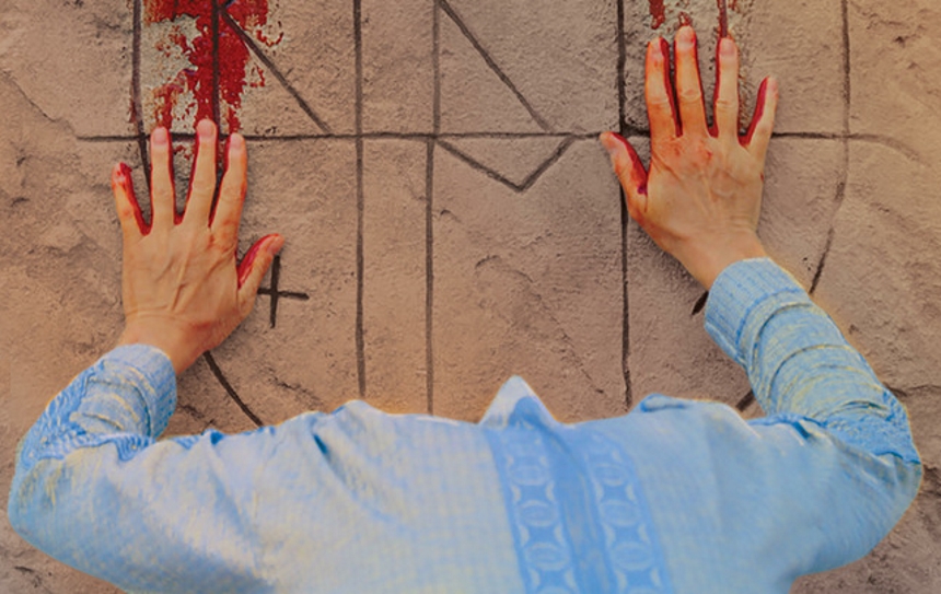
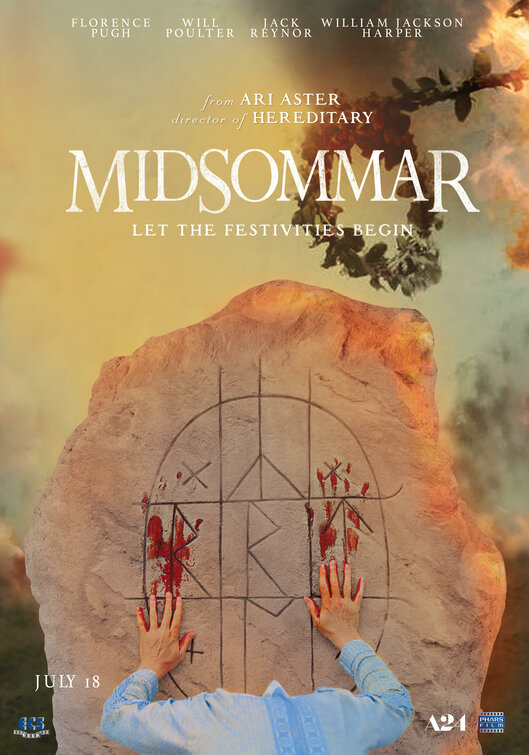
I am revisiting Midsommar's marketing excellent campaign again, to attempt to understand what is going on with the latest poster. Is the central figure here bowing their head? Is their 'head' supposed to be the runes marked on the stone? Is there a Highlander sequel stealthy inserted inside Ari Aster's follow-up to Hereditary?
Otherwise, the yellow-auburn sunset colour palette is catchy, particularly because it has a sickly tinge to it, that gives more of a 'mustard gas' vibe than a healthy 'magic hour' look. Flames peak out the side, and the 'flower crown' imagery that has been central to this marketing campaign is present behind the title typeface.
I would say this poster would turn some heads in the multiplex, if the patrons had heads to turn.


