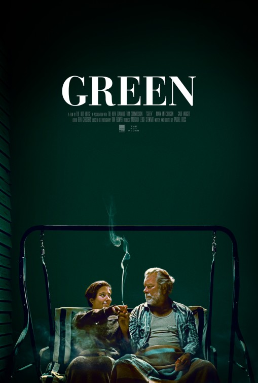
Friday One Sheet: GREEN

Why is it that you do not often see green movie posters? I could not tell you for certain, other than the colour is rather neutral and blends into the landscape of most multiplex aisles where these types of one sheets get maximum exposure.
But what are you gonna do if your movie is literally titled Green?
Either way, I like the copious negative space, the centred title and small credit block. This is a short film from New Zealand. Short film, small credit block.
The focus can remain on the offbeat friendly look the two smokers share in the centre bottom of the poster, where the dark green gradient subtly lightens like a dim spotlight. Here is another thing you do not see in movie posters very often: People smoking. About 40% of movie posters have a gun visible (I am making this statistic up, but I would not be surprised if it was reasonably close to the truth) but it is an unspoken no-no for cancer sticks to be shown.
Both of these elements add up to that delightful New Zealand insouciance. I hope I get a chance to see this short film on some platform this year. And kudos to designer Timothy Barlow for bringing some green into my life which is currently surrounded by the hellish white of a frozen Canadian winter.


