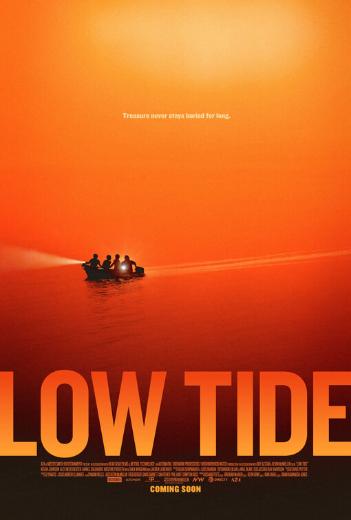
Friday One Sheet: LOW TIDE and Orange Gradients

Learn to love your gradient. That is the heart of the sunset orange glow of the key art for Low Tide. It's different, and minimalist, enough to grab ones attention in a multiplex hallway of crowded photoshop nightmares (i.e. typical movie posters).
Promising a modern, edgier, Goonies-style treasure hunt with its ominous (but tiny) tagline, and silhouette of four children in a boat, A24 keeps the imagery small, and the title card HUGE. Fitted with its own set of contrasting gradients, the title daring to bleed right to the side-edges of key art.
The credit block has more sanity in its (much) smaller size, and centred positioning below the title. And, all that negative space in the top half of the poster incites goosebumps! SWOON.
(Note: The trailer also was released recently; it is embedded it below.)


