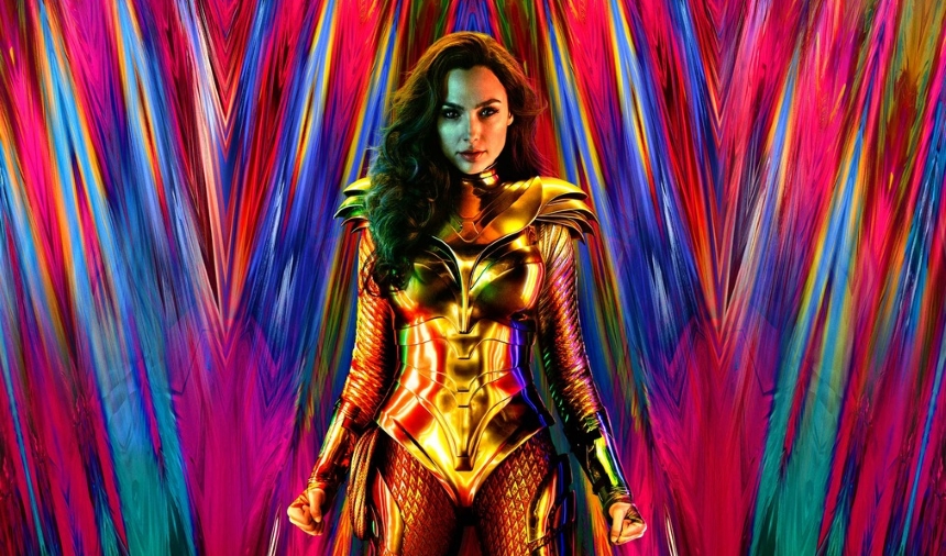
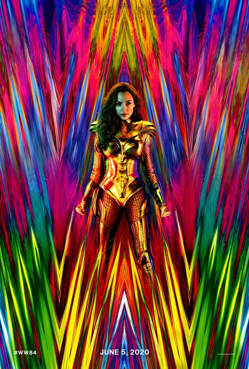
Friday One Sheet: WONDER WOMAN 1984

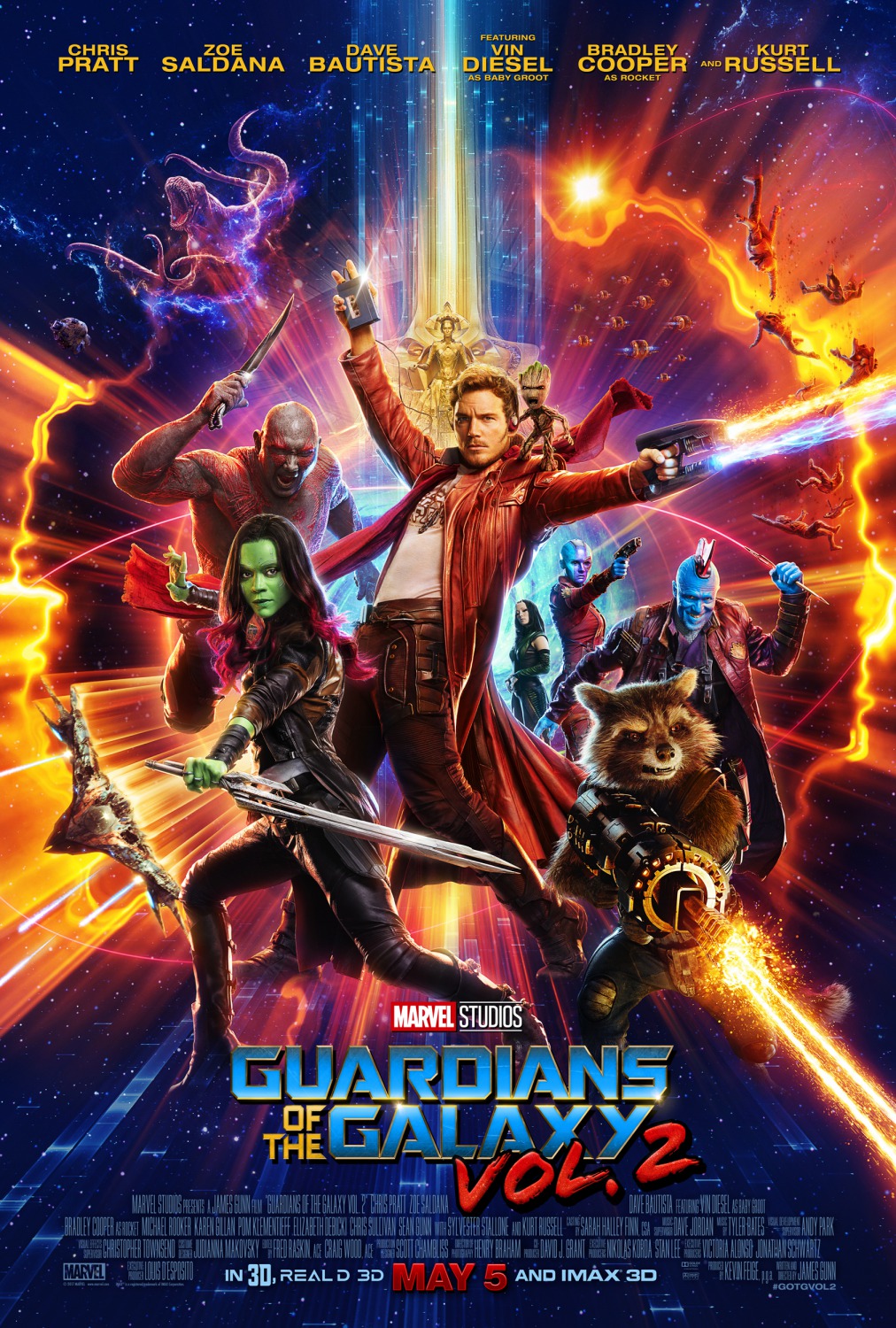
Call it the Guardians Of The Galaxy Effect. When Marvel Studios took the chance on adapting 'the oddballs save the universe to the sounds of a rockin' mix tape', with a big budget and a lot of humour, they went big primary on the cinematic colour palette, both in the first film's cinematography, and in sequel's key art.
Shortly thereafter, Taika Waititi's equally 'joked up' Thor: Ragnarock poster went for a 'neon candy crush,' flavoured design with 1980s era inspired typesetting and graphics.
As with many things, the creators behind the DC Extended Universe of films, are watching and mimicking the Marvel Comics Universe. The next entry in the Wonder Woman series of films, while admittedly set in 1984 (as per the title) is also borrowing the extremely colourful key art design for its initial teaser poster from WorksADV.
I wonder if it will continue to lean into the humour from the first film. This postes suggest so.


