IFFR 2008: FEAR(S) OF THE DARK Review

Ardvark here, with a review by GhibliWorld.com's Peter van der Lugt, animation expert extraordinaire.
Especially for ScreenAnarchy he converts his festival experiences into text. And lo and behold, this time it's about an animated feature!
"Has the organization of the International Film Festival Rotterdam been feeling down? Not only is this year’s festival logo and poster all black and white, in the field of animation it has lost its color as well. Well, literally and in terms of quantity that is.
Luckily, all isn’t bad at all, as quality wise things are quite colorful. Japanese animation fans can get their fix with Aramaki Shinji’s entertaining Appleseed Ex Machina. Furthermore, the critically acclaimed Persepolis forms another must-see, as in the Netherlands it hadn’t been screened yet (by the way it’s currently topping this year’s KPN Audience Award). And to already end the list is another very interesting animation piece called "Fear(s) of the Dark" (original title: Peur(s) du Noir).
Read on after the break...
Being part of the IFFR’s Rotterdämmerung program, a section featuring amusing, hallucinogenic and sometimes downright scary films, Peur(s) du Noir brings a mix of black and white animation logically aiming at the last: being scary. Several of today's best illustrators and comic-strip artists went back to the origins of their terrors and agreed to animate their drawings for this French omnibus feature which is obviously targeted at adults. The result is a 82 minutes viewing experience in which a total of 6 intertwined stories made by Blutch, Charles Burns, Marie Caillou, Pierre Di Sciullo, Lorenzo Mattotti and Richard McGuire, have been smartly crafted into one piece of work under the art direction of Etienne Robial.
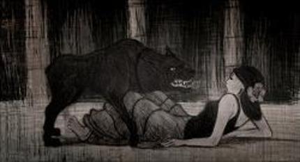
 In advance one might wonder if Fear(s) of the Dark is following a trend of French colorless animation a la Renaissance and Persepolis. As a stylistic thing or perhaps a solution to save on budget. Fortunately, none of that is the case. Taking away color only to leave the starkness of light and the pitch black of shadows nicely helps to express these “fears of the dark”. This is proven at the beginning of the feature, strongly opening with a story animated from the hands of Blutch. In it a kind of Spanish nobleman sets out with four big bloodthirsty hounds. Though technically Blutch didn’t play by the rules, some of the backgrounds contain some very slight colors, it ended up being one of the best pieces. Not only being the scariest, but also due to his successful mood and setting conveyance: in a quick and direct hand drawn style, without flourishes, immediate and rough and without losing that “certain touch”.
Soon after its start, Blutch’s piece is changed for Charles Burns’ story about a nerdy insecure teenage boy falling victim to an attractive girl due to his fascination with insects. As was to be expected, Charles Burns made a great one in terms of style and also the most story-driven… Thirdly intertwined is Marie Caillou’s story of 11-year-old Sumako falling victim to nightmares in a psychiatric institution. With these taking place in a Japanese setting her part clearly gives a Tarantino feeling. Not in the way it looks, though in the way Tarantino honors his influences in his movies. Caillou clearly shows her fondness of Japanese animation, resulting in something a bit unoriginal and clichéd. At least for those familiar with Japanese animation.
Shortly mixed between the various stories some abstract geometric inserts about the human state made by Pierre Di Sciullo. It didn’t interest me at all and the fact that I’m leaving it at that will say enough. Luckily, all is changed with a beautiful kind of hand drawn story animated by Lorenzo Mattotti in which people mysteriously disappear in marshy places…
Finally, all is tied up with Richard McGuire’s mustached bald man finding out all is not well in the house where he seeks shelter. In itself his story isn’t that scary. This is however greatly solved by the way McGuire manages to use Peur(s) du Noir’s “colors” in a most creative and cleverway, making one wanting to find what is going to happen next.
To conclude, all trying to bring a certain type of phobia, disgust or nightmare come to life, some parts of Peur(s) du Noir work terrifically good and some less. That doesn’t really matter, because the differences in quality, but also style and length of the stories, give Peur(s) du Noir a nice change and rhythm. The result of mixing all these up is a whole being more than the sum of its parts when separately screened. Highly recommended, even for non-animation-loving-festival-goers.
Signed on January 30, 2008 by GhibliWorld.com’s Peter van der Lugt at the lovely 37th International Film Festival Rotterdam."
Ardvark here again. I planned to post my own review but it would add precious little to Peter's.
Biggest surprise for me was that the Charles Burns segment was in 3D CGI, which may sound awful but is actually jaw-dropping in execution and unlike anything I've ever seen before.
Thanks Peter!


