Friday One Sheet: SCARY STORIES TO TELL IN THE DARK

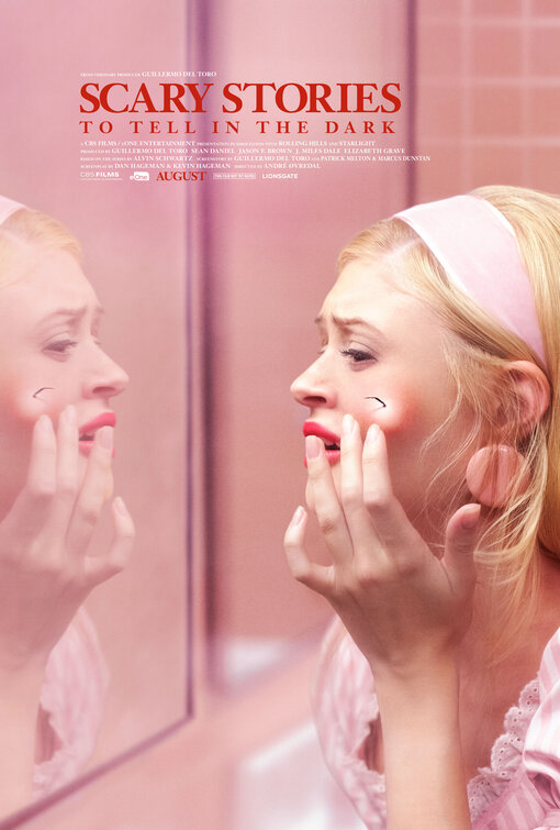
Uncluttered concept, unconventional placement of credit blog, and pastel pink horror - The latest anthology film has a suite of posters that know the value of negative space, but none quite as striking as this bathroom nightmare.
Does it get under a sensitive observer's skin due to the angry complexion-ruining red spot, or the insect appendage coming out? That the woman is looking in the mirror is subtle design code to look closer, and that she is pointing (in this case, hesitant and afraid to touch) to the eggsac blemish, anyone walking by could spot the core idea at a glance.
Also, I am still not tired of pinks used in poster design. Miraculously.


Do you feel this content is inappropriate or infringes upon your rights? Click here to report it, or see our DMCA policy.


