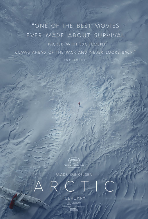
Friday One Sheet: God's Eye View in ARCTIC

Maximizing negative space is a tried and true strategy to communicate "Survival Movie" with your key art. Big kudos to design studio B O N D for going all the way with the full God's Eye snowy wasteland view for the Mads Mikkelsen-starring Arctic.
Note the footsteps that draw the eye back to the crashed plane in the corner. Can you communicate clearer the value proposition of the film?
While the 'skinny font' is generally code for 'upscale science fiction' (see here, and here, and here), perhaps they were simply extending the 'minimalism vibe' with the typeface.


Do you feel this content is inappropriate or infringes upon your rights? Click here to report it, or see our DMCA policy.


