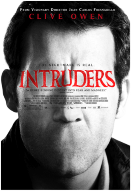
Have Your Say: Is This the Worst Movie Poster of the Year?

Bad movie posters come out all the time, but every once in a while, a poster is released by a studio that is so awful, it makes you just scratch your head and say, "Who is in charge over there?"
This seems to be the case with the brand new poster for Millennium Entertainment's US release of Juan Carlos Fresnadillo's The Intruders. The film played at TIFF last year with little fanfare. It's a pretty standard thriller and a bit disappointing from a promising talent like Fresnadillo.
From the pres release:
Though no one can see him, Hollow Face lurks in the corners, desperately desiring love but only knowing how to spread fear and hate. He creeps into the life of John Farrow (Clive Owen) after Farrow's beloved 13-year-old daughter Mia (Ella Purnell) is assaulted in their home. The line between the real and the imaginary blurs as fissures start to open within the family unit. It seems that no security measure can keep Hollow Face out.
So I suppose the freakish face is supposed to be Hollow Face, but to me it just looks like a really bad Photoshop job of Clive Owen's face done by some 9th grade computer graphic arts students (Shout out to Mr. Drake's 9th grade computer graphic arts class where I think I did the same hack job on my biology teacher's face).
And what is the deal with the title and billing block? Why are they in the middle of his face? Is it to disguise just how bad the Photoshop work really is? As any Photoshop geek knows, the old turn it to black & white trick goes a long way to making your blending look more professional.
There are a ton of bad posters out there, sure. But it would seem to me we have a front runner for worst of 2012. So what do you think? Is this the worst poster you have ever seen? Or is it just the worst poster so far this year?
Have your say!


