Pretty Packaging: The French PERFECT BLUE Is A Total Jawdropper

As part of celebrating 100 years of Japanese animation, French distributor Kaze released a special edition of Perfect Blue, Satoshi Kon's debut film as a director.
This happens to be one of my favorite anime. Satoshi Kon basically used the tropes of Italy's psycho-sexual "gialli" thrillers to create a unique perspective on extreme stress, and while many people wondered why this film is animated instead of live-action, it allowed for some seamless tinkering with hallucinations and illusions.
Released back in 1997, Perfect Blue has been a major influence for many directors, and is openly referenced (sometimes credited, even) in films like Black Swan and Requiem for a Dream.
Seven years ago, Satoshi Kon was unexpectedly diagnosed with pancreatic cancer and died a few months afterwards, at the incredibly young age of 46. I'd be hard-pressed to think of an artist whose passing I mourn more. I applaud Kaze's choice to use one of his films as an example of a highlight within a huge industry.
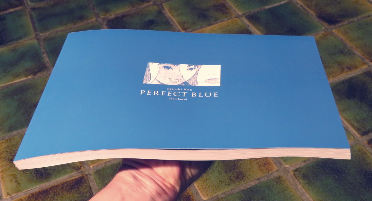
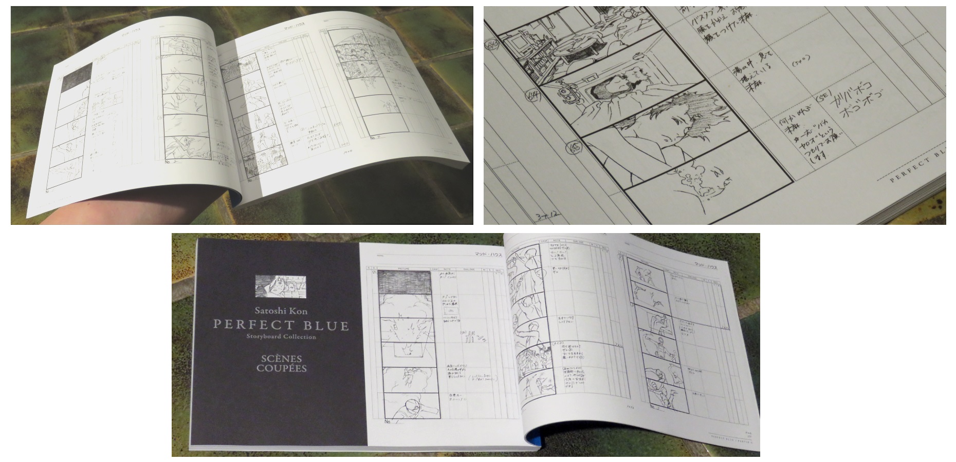
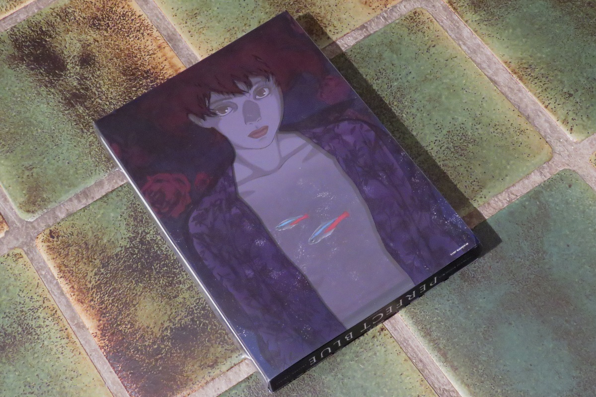
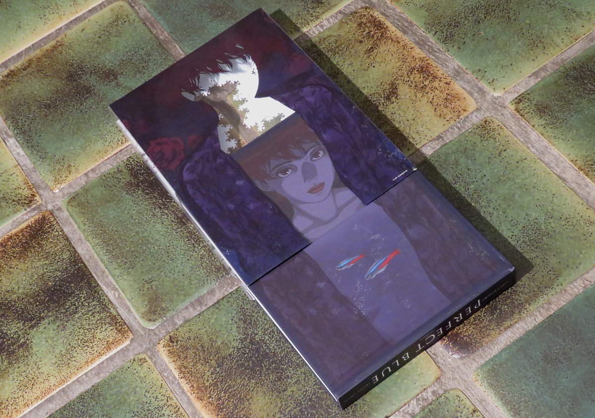
Of course, as a big fan I owned Perfect Blue already, it's not even the first time the film pops up in this series of articles, heh.... But the new French edition contained artwork books and was, while pricey, not terribly expensive. So I went for it.
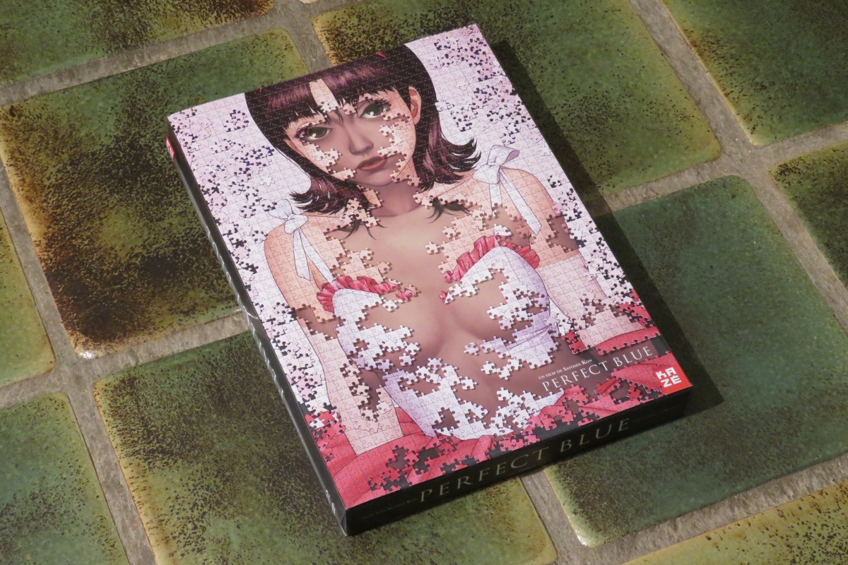
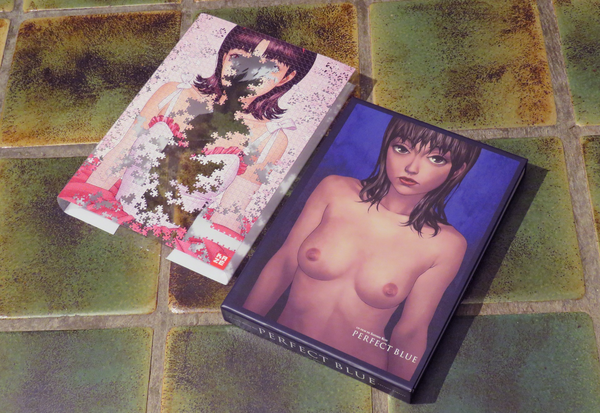
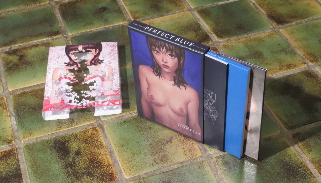
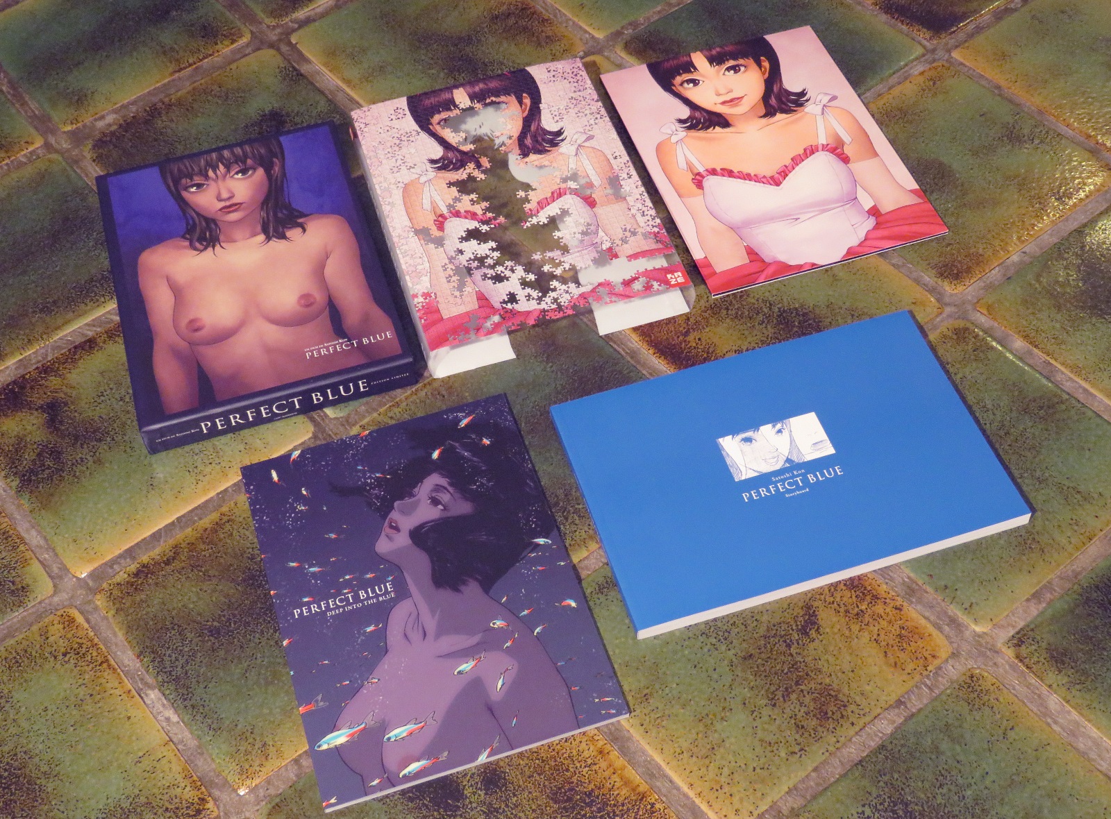
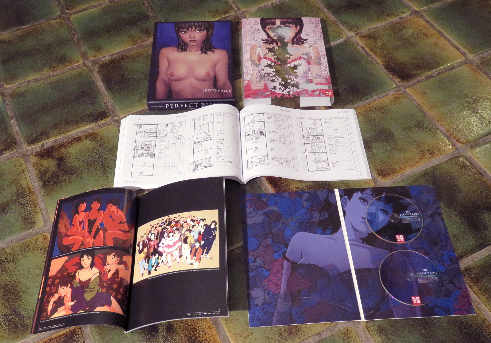
It arrived yesterday and while I expected it, I didn't recognize it because of the size of the package it was in. I expected a regular boxset, but what I got was the size of a coffee table book. When I unwrapped it my jaw hit the floor and bounced a few times.
Now, a few words of warning: this set is French-friendly, not English-friendly. There are French dubs and subs, not English ones. On top of that, the Blu-ray and DVD are coded for Europe (region B and region 2 respectively), so if you buy this for the discs make sure your equipment can handle that.
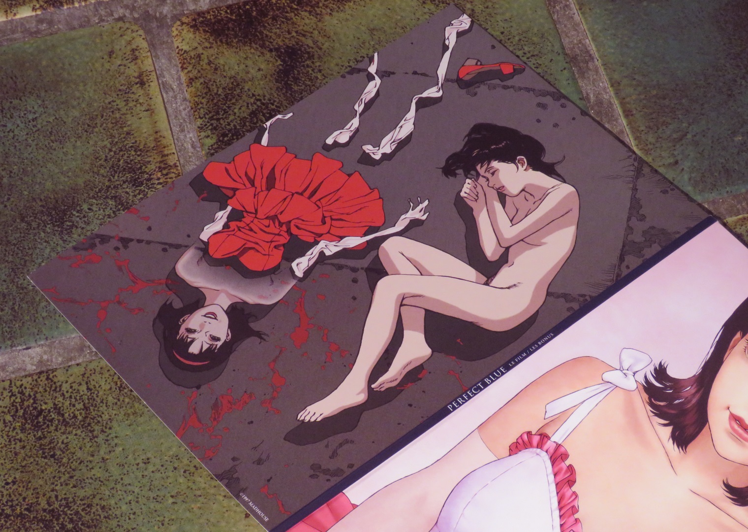
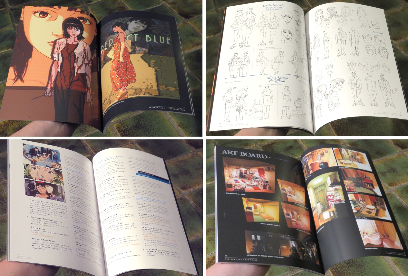
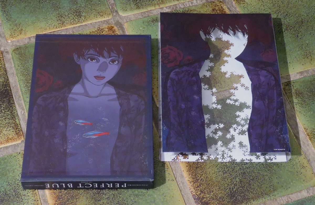
Here is a gallery of shots. Click on the edge of the pictures to scroll through them, or at the center of each to see a bigger version. Which I recommend, because... well, feast your eyes!


This happens to be one of my favorite anime. Satoshi Kon basically used the tropes of Italy's psycho-sexual "gialli" thrillers to create a unique perspective on extreme stress, and while many people wondered why this film is animated instead of live-action, it allowed for some seamless tinkering with hallucinations and illusions.
Released back in 1997, Perfect Blue has been a major influence for many directors, and is openly referenced (sometimes credited, even) in films like Black Swan and Requiem for a Dream.
Seven years ago, Satoshi Kon was unexpectedly diagnosed with pancreatic cancer and died a few months afterwards, at the incredibly young age of 46. I'd be hard-pressed to think of an artist whose passing I mourn more. I applaud Kaze's choice to use one of his films as an example of a highlight within a huge industry.
Of course, as a big fan I owned Perfect Blue already, it's not even the first time the film pops up in this series of articles, heh.... But the new French edition contained artwork books and was, while pricey, not terribly expensive. So I went for it.
It arrived yesterday and while I expected it, I didn't recognize it because of the size of the package it was in. I expected a regular boxset, but what I got was the size of a coffee table book. When I unwrapped it my jaw hit the floor and bounced a few times.
Now, a few words of warning: this set is French-friendly, not English-friendly. There are French dubs and subs, not English ones. On top of that, the Blu-ray and DVD are coded for Europe (region B and region 2 respectively), so if you buy this for the discs make sure your equipment can handle that.
Here is a gallery of shots. Click on the edge of the pictures to scroll through them, or at the center of each to see a bigger version. Which I recommend, because... well, feast your eyes!
Do you feel this content is inappropriate or infringes upon your rights? Click here to report it, or see our DMCA policy.


