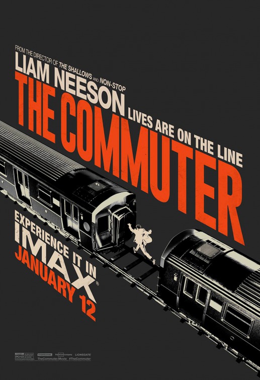
Friday One Sheet: THE COMMUTER (and Perspective Text)

Ever since the Saul Bass designed opening titles of North by Northwest, key art designers have used perspective text to imply 'on the run.' This minimalist (one of very many great Bass inflectected designs from LA Studios) key art, quite literally, runs with it.
Clean lines, a solid-fill image of a man leaping from train car to train car is powerful in its simplicity. (And the tagline "Lives are on the Line" has one extra meaning in light of this vector-ish poster).
It is also noteworthy that this is the IMAX release poster for the film. I have noticed a trend that the IMAX posters tend to be simutaneously more 'classic' (often hand drawn or non-photographic) and even a bit 'experimental' at the same time; two attributes that I wish were applied to more mainstream studio release.
Bass, if he were with us today, would be smiling at this one, I think.


 (1)-thumb-80x80-93563.jpg)

